Tag Archives: museum

The art of slowing down learning

Photo by Alexander Sheko

This blog post led me to a New York Times article (13 Sept. 2014) by Stephanie Rosenbloom : The art of slowing down in a museum.

There is something in this message that speaks to me about Connected Courses. Many of us have already remarked that the course is bursting and exploding with the wonderful shared information and ideas.  Mia Zamora even made sure, at the start of the course, that we acknowledged it was a guilt free zone. We were encouraged to dip in and out of things that spoke to us rather than tick off a (massive) list in a course which isn’t actually linear.

For me Connected Courses have been the most valuable and inspiring form of professional development – maybe ever. I even wished I didn’t have to sleep so I could keep learning and stay in the  conversations that were mainly happening in different timezones to mine. But at the same time I feel like a child who is overwhelmed by too much choice, and currently I’m aware that I’m running from this to that, not staying too long in case I miss out on something.

At times I feel like I’m skimming the surface; I would also like to go deeper. After all, there should be more times when I stop feverishly multi-saving to Diigo/Pinterest/Feedly and sit down to digest some things at a reflective pace.

The art of slowing down in a museum really resonated with me, and I started drawing parallels between looking at art works and reading and watching what the Connected Courses community shares.

If the average visitor spends 15 to 30 seconds in front of a work of art, according to museum researchers (as stated in the article), how does this compare with the amount of time we spend reading (and thinking about) shared blog posts or articles?  If we tweet out an article or post so quickly  that it becomes obvious we couldn’t possibly have read it properly, or at least read it deeply – and I’ve done that many times (even halfway through reading) charged by a passionate response and the desire to share – then are we being too superficial, and should we just take the time to read one thing more deeply?

Does ‘the breathless life of the Internet age conspire to make that feel normal?’ There is no doubt that our behaviour on social media is fast paced. ‘But  (as stated in the article) what’s a traveler with a long bucket list to do? Blow off the Venus de Milo to linger over a less popular lady like Diana of Versailles?’ How much breadth do we sacrifice for depth?

Professor Pawelski, who studies connections between positive psychology and the humanities, states that people who visit an art museum quickly and look at art in the same way as they might tick off a large reading list of books, see as much of art as you would if you read books by looking at their spines. He says that ‘ if you do choose to slow down — to find a piece of art that speaks to you and observe it for minutes rather than seconds — you are more likely to connect with the art, the person with whom you’re touring the galleries, maybe even yourself’.

So I’m thinking about my own behaviour in Connected Courses, and reflecting on how much I slow down for, and how deeply I’m engaging with thematic offerings. Of course, we don’t always have the luxury of unlimited time when we’re all juggling #ccourses with work and life, but it’s good to stop and reflect.

As a teacher librarian I’m like a squirrel gathering the goodies and adding to the stockpile so that I can curate best quality resources across the curriculum, or provide teachers with exactly what they want at point of need. But finding resources is only one part of my job, and I’m convinced that ‘connecting with the art’  in a way that enables me to connect with myself – metaphorically speaking – will benefit the teachers and students whose learning and teaching I support.

When Professor Pawelski asks his students to spend 20 minutes in front of a single painting,  he is confident that they will actually begin to be able to see what they’re looking at. The article also includes an interesting anecdote about Dr Julie Haizlip, a scientist and self-described left-brain thinker, who was a little skeptical about this exercise, and who confessed that she ‘had never spent 20 minutes looking at a work of art and prefers Keith Haring, Andy Warhol and Jackson Pollock to Matisse, Rousseau and Picasso’. ‘Rather than check master works off a list as if on a scavenger hunt’, the exercise aimed at finding an art work that resonated with her on a personal level.

At first nothing grabbed her attention but eventually ‘she spotted a beautiful, melancholy woman with red hair like her own. It was Toulouse-Lautrec’s painting of a prostitute, “A-Montrouge” — Rosa La Rouge.’

Source: Wikimedia

“I was trying to figure out why she had such a severe look on her face,” said Dr. Haizlip. As the minutes passed, Dr. Haizlip found herself mentally writing the woman’s story, imagining that she felt trapped and unhappy — yet determined. Over her shoulder, Toulouse-Lautrec had painted a window. “There’s an escape,” Dr. Haizlip thought. “You just have to turn around and see it.”

“I was actually projecting a lot of me and what was going on in my life at that moment into that painting,” she continued. “It ended up being a moment of self-discovery.”

Dr. Haizlip had been looking for some kind of change in her professional life but wasn’t sure what. Three months after looking at the painting, she changed her practice, accepting a different position.  She said:

“There really was a window behind me that I don’t know I would have seen had I not started looking at things differently.”

We have so many interwoven responses to the weekly themes in Connected Courses – so many wonderful perspectives, and so many engaging conversations, so many ‘aha’ moments. The value of the course is the community: the human interaction.  It really isn’t  about the content as much as the energy and elucidation which comes from connections within the cohort. It’s messy, and it’s frustrating – because we can’t capture everything or follow something to its neat conclusion – but it’s exhilarating. But if we don’t stay long enough in a post, article or webinar, if we don’t grow the personal connections, we’ll miss the meaning that is ours. Reading other’s reflections is not the same as looking for our own.

And while I secretly want to read everything (and capture it forever in my carefully crafted bookmarks and boards), I know that I need to let go of wanting the whole lot in order to focus more deeply on what speaks to me, and stay for a while, playing with others in that space.

Might you miss some other works by narrowing your focus? Perhaps. But (as Professor Pawelski put it), sometimes you get more for the price of admission by opting to see less.

Vilhelm Hammershøi - interior, young woman seen from behind (1904)

Prado in Google – a closer look at art

[youtube=http://au.youtube.com/watch?v=D1EOJr11bvo]

Viewing a Velasquez or a Rembrandt in a place like Spain’s Prado museum is a unique experience. Now you can use Google Earth technology to navigate reproductions of the Prado’s masterpieces, delving even deeper into the Prado’s collection. In Google Earth, you can get close enough to examine a painter’s brushstrokes or the craquelure on the varnish of a painting. The images of these works are about 14,000 million pixels, 1,400 times more detailled than the image a 10 megapixel digital camera would take. In addition, you’ll be able to see a spectacular 3D reproduction of the museum.

You can have this exquisite experience in Google Maps. There are 3 paintings you can currently view here, with a new painting a day after that for the next two weeks. I zoomed into Bosch’s ‘The garden of earthly delights’ and saw some very strange things happening in detail.

If you visit the Prado museum in Spain through Google Earth like I did, you’ll be able to view paintings in high resolution, as I did when I clicked on Goya’s ‘The 3rd of may’.  Here’s what it says once you get there:

We present a virtual tour of fourteen masterpieces from the Museo Nacional del Prado, displayed in ultra high resolution, enabling you to see details of the paintings that have never been seen before. Thanks to the high resolution of the digital images, you can view the whole painting or zoom in on a small fragment. Given the plethora of masterpieces housed at the Museum, choosing which works to include was no easy task but this selection represents the best of the collection.

What a way to learn; you can zoom into these works of art from wherever you are.

Jonathan Jones has a great art blog on guardian.co.uk has an interesting post with the pros and cons of this virtual art gallery.

I’ll get off now so you can get on with the virtual trip.  Have fun.

Guggenheim 2.0

The Guggenheim Museum in NY has a great little online event going which encourages interaction and collective thought around some of its collection. 

Catherine Opie is an American artist specialising in issues around documentary photography.

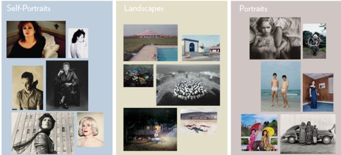
For this exhibition, Catherine Opie has selected images from the Guggenheim Museum’s photography collection and organized them into three sections: Self-Portraits, Landscapes, and Portraits. Visitors can write responses to the questions Opie poses about them and read other people’s responses.

Here are some more details from the Guggenheim Museum website:

September 26, 2008–January 7, 2009
While celebrated for her role behind the camera, Catherine Opie remains acutely aware of the voices of her subjects, and the diverse readings all images engender. Exploring this circuit of interpretation, Opie has selected images from the Guggenheim Museum’s photography collection to present alongside questions about the works’ themes and meanings, inviting museum visitors to respond with stories of their own.

People can participate online by writing about a photograph or reading other people’s comments.

guggenheimThe

I clicked on one of the portraits.

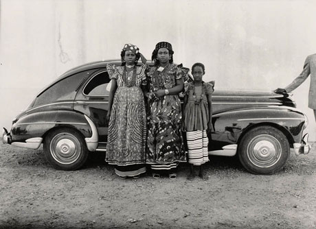
3infrontofcar

 These are the questions asked about the portraits:

What do you think makes a portrait interesting?

  • How do the titles of these photographs make you think differently about the people they portray?
  • Some of these images are made spontaneously while others are carefully staged by the artist. How does this difference in approach affect your response?

Here is one of the responses:

An interesting portrait to me is one that represents people honestly. Not only is it usually aesthetically pleasing, but it also is educational and interesting. In Keita’s photo of 3 women, she presents them in their usual daily clothing, telling the viewer something about their environment and status, and then the juxtaposition of the car brings to mind a completely different world or environment. The two together represent a very real albeit somewhat staged composition that’s intriguing and interesting.

I was excited to find this, and I’d like to keep up with the many innovative programs and ideas coming out of cultural institutions such as museums. The idea of  an artist selecting images from the collection is a creative way to bring out to more people what would normally remain within the walls of the museum, and perhaps not be accessed by as many otherwise. The addition of the questions and options to comment is added value,  inviting interaction and the sharing of opinions. I also like the fact that, whereas people would normally just look at the photos at an exhibition, maybe read a little about them, in this case the public is invited to express their impressions and opinions.

I was a little disappointed that only one or two responses were accessible, unless I’m missing something. I was looking forward to a real discussion and debate around the photos.

Nevertheless, an inspiring concept. This would be an excellent way to initiate discussion and reflection in the art classroom.

Learning through discovery at the Melbourne Museum

The Discovery Centre within Museum Victoria makes research interesting and hands-on. A young person can wander in and spend a few hours without realising that it’s been a learning experience. Let’s say you came in and browsed some of the 2,000 plus natural or cultural objects available – not just on display in cabinets and drawers, but also available to touch and examine – then you’d be able to delve into a little research in a number of ways; you could:

have a close look at these objects under magnifiers or video microscopes;
use the reference library of books, journals, education kits, DVDs or videos;
browse through the extensive collection of online resources on public computers;
and you could always ask a staff member for help.

When I visited the Discovery Centre as a student of teacher librarianship, the staff were eager to help, but not eager to supply a quick and easy answer – they encouraged students to find information and answers for themselves, pointing out resources available and suggesting ways of searching. The research process becomes a challenging discovery task, well supported by the excellent variety of materials and resources. It’s great to find research modelled in such an enjoyable way.

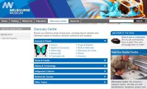
The Discovery Centre’s website is user-friendly, and offers an ‘Ask the experts’ section. If you have something you want identified, or you need help with a research project, you can email the museum’s information experts, either with a general request, or an identification request. Every week, there is a ‘question of the week’ published on the website.

I think this is a valuable resource for primary and middle years students. It’s great to take research out of the classroom, and into such a dynamic and resource-rich environment.

Collaborative project – Harvest of Endurance scroll

Human potential and creativity never cease to amaze me. Today I came across an online version of a work of art in the form of a 50-metre-long scroll representing two centuries of Chinese people in Australia. Harvest of Endurance is a painting in the traditional gong bi style depicting the story of hardship and resourcefulness of the Chinese in the history of Australia. Taking a little over 12 months to complete, the scroll is made up of 18 elaborately painted panels. It was purchased by the National Museum of Australia in 1992.

Appreciating the actual scroll is one thing, but just as impressive in its own way is the accompanying interactive website produced by the National Museum of Australia. You can explore the scroll from right to left along a timeline from 1788 to 1988 by clicking on stages which are described as eg. Australian gold rush; the rise of merchants, etc. In selecting a period, a scene forms in front of your eyes, first as an outline, then graudally as a complete coloured picture. Clicking on red arrows outlines an object or person, and provides you with a brief explanation or definition. There is a detailed audio-visual explanation of how to read the scroll, including how colour and form create the story, and an explanation of how the scroll was created from the point of view of the artist and the researcher.

The presentation of historical facts in artistic form, coupled with an interactive, multi-layered online representation, is a clever way to facilitate learning through exploration. Wouldn’t it be fantastic to create a similar project for students where each would have a choice whether to contribute as either a researcher, artist, technical expert or other. In particular, I like the way you can select parts of the picture for explanation or background, and I think that would be a great way for students to present their newly found facts.

The collaboration between the people of Australia and China in the form of the Australia-China Friendship Society aimed to promote friendship and understanding between the two countries and their cultures. It would be interesting to connect Australian students with students from another country, perhaps through blogs, in order to create a final product requiring collaboration and fostering friendship and mutual understanding. That would be an authentic and meaningful project.