Tag Archives: art

Visual Communication Design online resources – happy to share

(This has been reposted from Melbourne High School Library blog.)

Since I spend so many, many hours creating art and visual communication design resources online, it gives me great pleasure to share and know that people are using them.

I’ve recently added new resources in our Visual Arts and Visual Communication Design digital library – our Libguides.

On the Visual Communication Design page, look for the tabs at the top: Australian designers and design companies, Berlin designers/illustrators, European designers/illustrators, UK designers/illustrators, US designers/illustrators, and design agencies and organisations. All of these resources are new – I think you’ll love them because they are full of young, creative people and examples of the work, with links to how you can follow them on social media, eg Instagram, Facebook, Flickr, Tumblr, Twitter and other places. The beauty of the follow is that all the wonderful, new work comes to you in your feed and you’ll have daily inspiration to draw from. The diversity amongst the artists is amazing – in fact, you’ll be overwhelmed it (in a good way).

I’ll leave you with a few examples:

From the Berlin designers/illustrators page: Maria Bustamante (aka notflipper)

From the European designers/illustrators page: French artist Koralie. You can follow her onTumblrFacebook and on this website.

On the UK designers/illustrators pageJack Sachs is a London based 3D animator and illustrator.Read his blog and follow him on Twitter.

Nicolas Menard is a French Canadian graphic artist working and living in London. He makes drawings, prints, animations, books and interactive. Follow him on Vimeo,on tumblr, on Twitter, and on Instagram.

On the US designers/illustrators page, so far we have Ari Weinkle and you can follow Ari on Instagram, Facebook, Tumblr and Twitter.
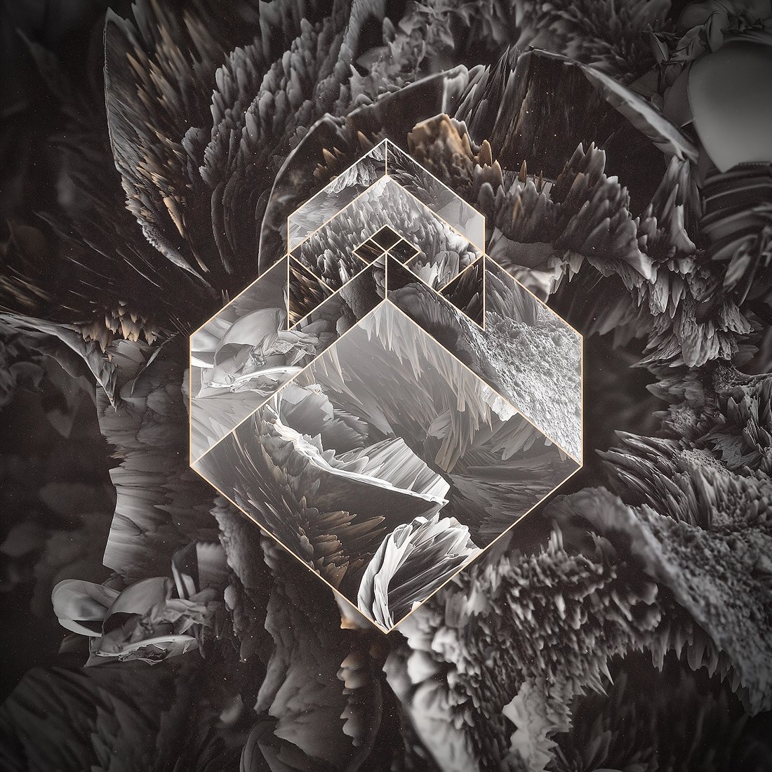
Under Australian designers and design companiesKindred Studio is the multi-disciplinary studio of Sydney based Illustrator, Designer and Art Director Andrew Fairclough. Follow him on Instagram, on Twitter and Skillshare.

Benja Harney is a paper engineer. Follow him on Instagram. Benja is based in Sydney, Australia.

Also new in the Visual Arts libguides are most of the resources under the tab ‘For teachers’. There’s a lot of text here and so it doesn’t look very exciting but, believe me, if you take the time to explore the links you will not be disappointed. For example, in the box ‘general resources for teachers‘, I would recommend having a good look at Deon Van Dorp’s website. I met Deon in the High School Art Teachers Facebook group – a private group so if you want to join, just ask and wait to be approved. Deon is one of many art teachers sharing their expertise and student work examples here. Have a good dig around on Deon’s website, under all the tabs. For example, under the ‘More’ tab at the top, you will find Deon sharing the processes he goes through with students and examples of student work. Deon includes detailed descriptions of tools, techniques and shows the progress of student work from start to finish.

Also under the ‘More’ tab are examples of student visual diaries. There is lots of student work organised by year level throughout the website.

Flickr is another amazing resource for examples of art work including student work. I have a selection of these in the Visual Arts libguide (for teachers) under ‘student art work on Flickr’, for example, Monks Dyke Tennyson College, Lincolnshire. Don’t forget to select ‘albums’ when on Flickr to see different projects. There are many examples of student sketchbooks/folios, such as this one. I can’t share any images here because the permissions are restricted but you can still look.

On the same libguides page under the tab ‘for teachers’ there is a big selection of art teacher websites with examples of work. Developing Nicely by Chris Francis, UK Art teacher and Senior Leader at St Peter’s Catholic School, Bournemouth, England. The blog contains thought-provoking articles that are illustrated with creative, contemporary student artwork.

Ms King’s AP Studio Art Class This blog contains activities cover perspective, line drawing, the depiction of glass and metal objects, working in monochrome, figure drawing and still life arrangements.

InThinking Visual Arts is a website for International Baccalaureate Art teachers written by Heather McReynolds, who has over 20 years of teaching and examining experience. Heather was previously Head of Art at the International School of Florence and now offers training and workshops for IB Art teachers, writes textbooks and shares knowledge via the InThinking Visual Arts website. Although this site is subscription based, there is enough free content to keep you busy for hours. For example, you can read an interesting article on attitudes to beauty.

Fortismere Art Department has lots of useful things under the tab ‘student area’ including ‘practical support’ (for photography, painting, film and more)  and ‘web tools’, such asphoto- and video-sharing, and also under the ‘student area’ tab, under ‘research support’ there is ‘research and analysis‘, ‘creative thinking’ and resources for photography genres eg portraiture.

Also helpful on this page is the box with tips from a high achieving art student.

I’ve also made a start on resources for students under the tab of the same name.

Sometimes it’s overwhelming navigating your way through our online resources so I hope it was useful for me to highlight a few of our newly created areas. Enjoy!

What does colour sound like? Neil Harbisson – cyborg

The life of Neil Harbisson is like something out of a sci-fi novel. Neil was born with achromatopsia, a rare condition that leaves 1 in 30,000 people completely colorblind. But Neil isn’t colorblind, far from it. After convincing his doctors to implant an antenna onto him,  Neil now possesses a new sense – the ability to hear colors. Neil takes you through a day in his life and you into  an entirely new world.
I had never heard of Neil Harbisson, and his condition. In particular, the antenna sounded so bizarre to me that I started researching online to see if it was a hoax, while thinking ‘please be true’ because it was so fascinating.
My younger son has a kind of synaesthesia and has always been able (or at least from the time he could articulate this) to hear colours. But he can also see colours. I remember being fascinated when I first found out and quizzed him to check whether he was consistent. I also discovered that some musical notes had a food association for him which just sounded silly to me. For example, when a note sounded like chicken or mango I started to think he was just making it up. But he wasn’t.
It’s so interesting to think about Neil Harbisson’s very different perception of things. I pulled out some of what he said in the video:
“I don’t feel that I’m using technology, I don’t feel that I’m wearing technology –  I feel that I am technology. The software is a part of my mind, and the antenna is part of my body.
“I have conversations with people about their perceptions of reality.
I scan their face and tell them how they sound. Now that I can hear colour I have connections – the horn of a taxi is related to lime because it sounds just like a lime.
“I used to think humans were black and white.
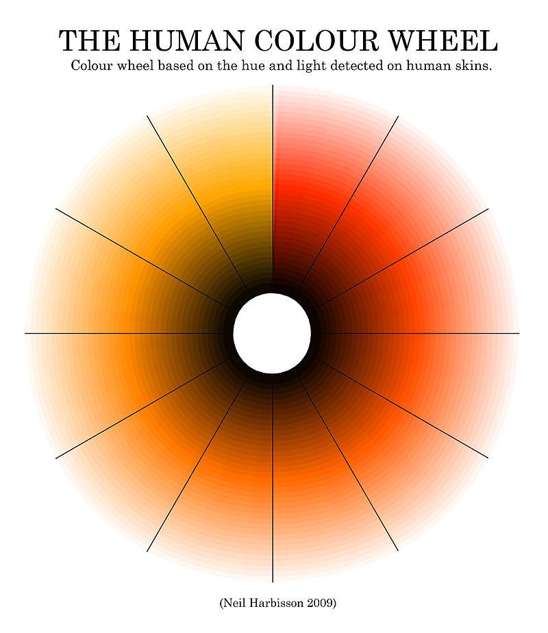
People are not black or white; they are a light orange or dark orange.
If you look closely you’ll find there is no grey; it’s just unsaturated colour.

The Human Colour Wheel

A color wheel based on the hue and light that Harbisson detected on human skins from 2004 to 2009.[44] Harbisson states that humans are not black or white, humans are orange. Human skins range from very light to very dark shades of orange-red to orange-yellow.[86] (Source: Wikipedia)

I’ve also pulled some of what Neil talks about in the TED talk video):

(This is paraphrased, not word for word:)

At first I had to memorise the names you give each colour, had to memorise the notes, but after some time this became a perception and then a feeling, and I started to have favourite colours and to dream in colour. I felt that the software and my brain had united then. In my dreams it was my brain creating the electronic sounds. I started to feel like a cyborg. I felt that the cybernetic device became a part of my body, an extension of my senses and finally part of my official image.

Life has changed dramatically since I have been able to hear colour. I can listen to a Picasso. Going to a supermarket is like going to a nightclub, full of different melodies especially the aisle of cleaning colours.

I used to dress the way that looked good, now I dress so it sounds good. Today I’m dressed in C major.

The way I look at food has changed. Now I can display my food on my plate so I can hear my favourite song.

The way I perceive beauty has changed. When I look at someone I hear their face. They  might look beautiful but sound terrible. I create sound portraits.

I started having a secondary effect. Normal sound started to have colour. I started to paint music and paint people’s voices.

There are many colours around us that we cannot perceive. Now I can hear colours that the human eye cannot perceive, eg infra red and ultra violet.

Knowledge comes from our senses so if we extend our senses we will extend our knowledge. We should start creating applications for our own body. Which senses would you like to extend? Become a cyborg.

What does this say about our perception? Are we programmed to perceive one way which is actually not the only way?

If there are no black or white people, just shades of orange, then what is our perception of race based on? What about our perception of privilege?

Harbisson mixes up our perception of perception. He tells people how they sound by looking at them. He can listen to a Picasso. He can paint speeches in colour.

 Which senses would you like to extend? Become a cyborg.

No thanks, Neil. But thanks for the perceptual mashup.


How can we measure learning? Week 2 #rhizo15

Data or it didn’t happen.

— Shit Academics Say (@AcademicsSay) April 18, 2015

How can we measure learning? Can we measure learning? Define learning. What did I learn today? I learned about the Australian Indigenous artist, Vernon Ah Kee.

Ah Kee is also part of the Proppa Now group and is one of the most political aboriginal artists of his time.

The above is from his 2002 collection titled “If I was White”. I was interested in reading the transcript.

6×5 A4 grids transcribed L-R, downwards:

If I was White
I could walk down the street
and people would pay no particular
attention to me.

It may not seem like much
but if you’ve ever had
a shopkeeper tell you to
Buy something or move on, or
simply follow you around the shop,
it’s significant.

If I was White
people would speak to me.

Wouldn’t you feel a little lonely
if you were the only White person
in a new school
and nobody including the teacher
understood you or your culture?

If I was White
I would think like a White Person.

If I was White
I would believe myself to be equal
to anyone.

If I was White
I would be more likely
to live longer.

If I was White
I would be less likely
to spend time behind bars.

If I was White
just think of all the names
I wouldn’t have been called.

If namecalling does not seem
all that serious to you
then you haven’t heard the names
I’ve been called.

If I was White
a lot of the fights I’ve been in
would not have been my fault.

If I was White
I wouldn’t have been in so many fights.

If I was White
I would not be part of the Stolen Generation.

If I was White
I would have been counted in the Census since 1901.

If I was White
I could live, shop, and socialise
wherever I want.

If you’ve walked into Real Estate
Agencies where houses and units
To Let suddenly become Taken,
and just as suddenly become
Available when you leave, then
you know what I’m talking about.

If I was White
I would be accepted.

If I was White
I could group together
all the people who don’t
look like me
into their own separate
communities.

If I was White
I could accept a life of privilege,
wealth, and power
that the exploitation of Black
People has brought me
without even blinking.

If I was White
I could stand back,
walk on by, sit on the fence,
and do nothing.

If I was White
I would think I have every right
to be here.

If I was White
I would fit in.

If I was White
I would not have to live in a country that hates me.

If I was White
I would have a country.

If I was White
I could say This land
has been in my family
for three generations.

If I was White
I could say My family
have lived on this land
for two hundred years.

If I was White
I could say My father worked hard
to buy this land.

If I was White
I could buy bandaids
the same colour as my skin.

What if all bandaids were black?

If I was White
and in an accident, I would be
wrapped in white bandages.

If I was White
I wouldn’t be asked if I was
Fullblood, Half-caste, or part White.

If I was White
I would not hear other White People
say to me You don’t look like you
have alot of White in you, or
You don’t look White.

If I was White
my fair skin
would not be such an issue
with other White People.

If I was White
it would be okay
to claim to be White.

If I was White
I wouldn’t have to claim to be White
just to get a job.

If I was White
I would be taken at my word.

Try accepting everything written
here as being true
simply because I say it is.

If I was White
I could really identify with
Australian TV Soaps.

If I was White
I could really identify with
Australian TV Advertising.

If I was White
popular Australian newspapers
would print what I want to read.

If you don’t think so
then count how many Black People
appear in the weekend social
pages.

If I was White
I could go to church
and Jesus Christ would
look like me.

Imagine Christ images all over the
world being black.

If I was White
I would not have to be smart
to keep a good job.

If I was White
I would have more chance
of getting a job.

If I was White
I could wear a suit and tie
and not look suspicious.

If I was White
I could own a luxury vehicle
and not look suspicious.

If I was White
I could shop in luxury stores
and not look suspicious.

If I was White
I could walk
in a white neighbourhood
and not look suspicious.

If I was White
I could dye my hair blonde
and it would not look strange.

If I was White
I could have blue eyes
and it would not look strange.

If I was White
I could marry another White person
and it would not look strange.

If I was White
I would have a better chance of becoming PM.

If I was White
I could write history any way I please.

If I was White
ignorance could be my excuse.

If I was White
I would have nothing to fear
from Police.

If I was White
I would not have to explain
the things I say.

If I was White
the world would make
more sense to me.

If I was White
I could make myself believe
that Black People were evil.

If I was White
I could shelter my children from
the evil that exists in the world.

If I was White
I could lie to my children about
the evil that exists in the world.

But I am Black
and I am as misunderstood as the next Blackfella

but I am beginning to understand the White Men.

What did you learn from that text art by Vernon Ah Kee? Does it make you curious to  know more? Does your understanding shift into another context? Are you thinking about this in a broader sense? How did you feel when you were reading this? How did you feel when you were thinking about it?  How would you assess the learning during all of that?

Give yourself a mark out of ten. Make sure you address the outcomes which sit neatly in lines next to their dot points. Don’t forget to ignore everything that is not neatly summarised by these points. Don’t go including the metacognition.  Make sure you toss all those airy fairy ‘what if…’ thoughts. Don’t even think about including the way you felt when you were reading the text; that’s not important and we can’t be getting all touchy feely when we’re assessing serious learning outcomes.

So, back to Dave.

Dave:

Learning is a non-counting noun.  It’s not something we should worry about counting, I don’t think measuring it makes any sense. Once that’s done, what can we measure? Dig into the possibilities of measurement. What can we use to send to administrators? Some way of talking about using all these numbers and  How can we map out the rhizome? a tool for people to map out their own rhizome.  I understand this conflicts with the freedom but work with that.

Really. This is hard. If I knew how to do that …

Taking a look at my own learning which has taken place in MOOCs lately – Connected Courses and now Rhizo15…

If we are talking about connected learning rather than the consumption of learning then counting is no longer useful. You can’t ‘count’ connected learning but connected learning does count. Turn it on its head. It counts. Show it, write about it, share it, discuss it – make it transparent. There it is; you can see it for yourself.

Learning is complex. Yes, we could map it. But… there’s so much to take into account. It’s giving me a headache. Big data.  That term gets bandied about a bit lately. Looking it up on Wikipedia gives me a bigger headache. (Not sure where I saw this image; someone shared it on Twitter?)

And don’t forget –

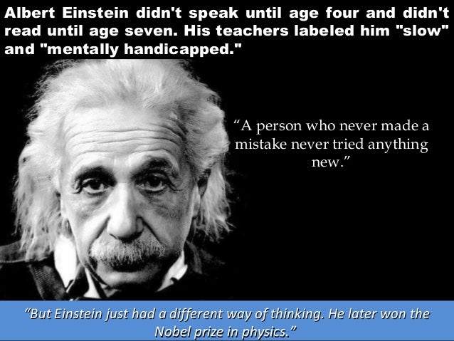
As I’ve said in a previous blog post, Einstein, Newton, Edison, Tolstoy, Pasteur, Lincoln – these are only some of the notable gifted people throughout history who were assessed as failures in school.

How could that happen? Is it happening now? How reliable are our methods of assessment? One thing I know – we should definitely assess assessment.

Dave Cormier, I can’t answer your question. Fail me.


Exploring ways teachers and students can use Pinterest

First day back at school term 2 is a curriculum day for us at Melbourne High School. The theme is ‘knowing highly able students and ourselves’. Apart from set keynotes we have the choice of running sessions and also selecting to attend others’ sessions. Mihaela Brysha (Head of the Visual and Performing Arts faculty) and I will be running a workshop about Pinterest. I’m sharing the presentation slides here.

I’ve been banging on about Pinterest for so long, you’d think I had shares in the company. For example, here, here, here, and here. Some of the earlier slides I’ve re-used from earlier presentations.

Pinterest is often overlooked by educators because it looks like a bit of fun with no substance. The power of Pinterest lies in the ability to find people who have curated the stuff you want. And then see who they are following. Although it’s an image-based platform – and that’s what makes it a preference for those who prefer visual collections – it’s also a good way to collect text-based things online as long as you can attach them to a picture. I use Pinterest and Diigo equally, sometimes saving the same thing to both. Diigo is more sophistocated in its options, allowing keyword searches, but also collaborative annotation. I just haven’t had much success selling it to teachers. When I want to share a collection of online resources with teachers, I often use Pinterest because it’s easy to see the contents at a glance. Of course, now everyone needs an account before they can even view what’s on Pinterest.
Meanwhile I find it difficult to comprehend that most teachers and students are happy either saving things to folders on their computers and therefore needing a USB, or going through their history. Come on people, there are much better ways to do that! And easier ways to share.

The art of slowing down learning

Photo by Alexander Sheko

This blog post led me to a New York Times article (13 Sept. 2014) by Stephanie Rosenbloom : The art of slowing down in a museum.

There is something in this message that speaks to me about Connected Courses. Many of us have already remarked that the course is bursting and exploding with the wonderful shared information and ideas.  Mia Zamora even made sure, at the start of the course, that we acknowledged it was a guilt free zone. We were encouraged to dip in and out of things that spoke to us rather than tick off a (massive) list in a course which isn’t actually linear.

For me Connected Courses have been the most valuable and inspiring form of professional development – maybe ever. I even wished I didn’t have to sleep so I could keep learning and stay in the  conversations that were mainly happening in different timezones to mine. But at the same time I feel like a child who is overwhelmed by too much choice, and currently I’m aware that I’m running from this to that, not staying too long in case I miss out on something.

At times I feel like I’m skimming the surface; I would also like to go deeper. After all, there should be more times when I stop feverishly multi-saving to Diigo/Pinterest/Feedly and sit down to digest some things at a reflective pace.

The art of slowing down in a museum really resonated with me, and I started drawing parallels between looking at art works and reading and watching what the Connected Courses community shares.

If the average visitor spends 15 to 30 seconds in front of a work of art, according to museum researchers (as stated in the article), how does this compare with the amount of time we spend reading (and thinking about) shared blog posts or articles?  If we tweet out an article or post so quickly  that it becomes obvious we couldn’t possibly have read it properly, or at least read it deeply – and I’ve done that many times (even halfway through reading) charged by a passionate response and the desire to share – then are we being too superficial, and should we just take the time to read one thing more deeply?

Does ‘the breathless life of the Internet age conspire to make that feel normal?’ There is no doubt that our behaviour on social media is fast paced. ‘But  (as stated in the article) what’s a traveler with a long bucket list to do? Blow off the Venus de Milo to linger over a less popular lady like Diana of Versailles?’ How much breadth do we sacrifice for depth?

Professor Pawelski, who studies connections between positive psychology and the humanities, states that people who visit an art museum quickly and look at art in the same way as they might tick off a large reading list of books, see as much of art as you would if you read books by looking at their spines. He says that ‘ if you do choose to slow down — to find a piece of art that speaks to you and observe it for minutes rather than seconds — you are more likely to connect with the art, the person with whom you’re touring the galleries, maybe even yourself’.

So I’m thinking about my own behaviour in Connected Courses, and reflecting on how much I slow down for, and how deeply I’m engaging with thematic offerings. Of course, we don’t always have the luxury of unlimited time when we’re all juggling #ccourses with work and life, but it’s good to stop and reflect.

As a teacher librarian I’m like a squirrel gathering the goodies and adding to the stockpile so that I can curate best quality resources across the curriculum, or provide teachers with exactly what they want at point of need. But finding resources is only one part of my job, and I’m convinced that ‘connecting with the art’  in a way that enables me to connect with myself – metaphorically speaking – will benefit the teachers and students whose learning and teaching I support.

When Professor Pawelski asks his students to spend 20 minutes in front of a single painting,  he is confident that they will actually begin to be able to see what they’re looking at. The article also includes an interesting anecdote about Dr Julie Haizlip, a scientist and self-described left-brain thinker, who was a little skeptical about this exercise, and who confessed that she ‘had never spent 20 minutes looking at a work of art and prefers Keith Haring, Andy Warhol and Jackson Pollock to Matisse, Rousseau and Picasso’. ‘Rather than check master works off a list as if on a scavenger hunt’, the exercise aimed at finding an art work that resonated with her on a personal level.

At first nothing grabbed her attention but eventually ‘she spotted a beautiful, melancholy woman with red hair like her own. It was Toulouse-Lautrec’s painting of a prostitute, “A-Montrouge” — Rosa La Rouge.’

Source: Wikimedia

“I was trying to figure out why she had such a severe look on her face,” said Dr. Haizlip. As the minutes passed, Dr. Haizlip found herself mentally writing the woman’s story, imagining that she felt trapped and unhappy — yet determined. Over her shoulder, Toulouse-Lautrec had painted a window. “There’s an escape,” Dr. Haizlip thought. “You just have to turn around and see it.”

“I was actually projecting a lot of me and what was going on in my life at that moment into that painting,” she continued. “It ended up being a moment of self-discovery.”

Dr. Haizlip had been looking for some kind of change in her professional life but wasn’t sure what. Three months after looking at the painting, she changed her practice, accepting a different position.  She said:

“There really was a window behind me that I don’t know I would have seen had I not started looking at things differently.”

We have so many interwoven responses to the weekly themes in Connected Courses – so many wonderful perspectives, and so many engaging conversations, so many ‘aha’ moments. The value of the course is the community: the human interaction.  It really isn’t  about the content as much as the energy and elucidation which comes from connections within the cohort. It’s messy, and it’s frustrating – because we can’t capture everything or follow something to its neat conclusion – but it’s exhilarating. But if we don’t stay long enough in a post, article or webinar, if we don’t grow the personal connections, we’ll miss the meaning that is ours. Reading other’s reflections is not the same as looking for our own.

And while I secretly want to read everything (and capture it forever in my carefully crafted bookmarks and boards), I know that I need to let go of wanting the whole lot in order to focus more deeply on what speaks to me, and stay for a while, playing with others in that space.

Might you miss some other works by narrowing your focus? Perhaps. But (as Professor Pawelski put it), sometimes you get more for the price of admission by opting to see less.

Vilhelm Hammershøi - interior, young woman seen from behind (1904)

Art is not just pretty pictures: The deep process of artistic creation

My topic today is Art as a subject in schools. I wonder if we sometimes underestimate or misunderstand the role of Art in a student’s learning. It’s so much more than making pretty pictures. Art personifies learning through a transparent process of deep exploration and problem solving – with an end product to show for it. Just as with literature, the end product can be unpacked to reveal the influences which were part of the creative process. Fortunately this is not a purely scientific process but one which invites the exploration and interpretation of the viewer. Art is a model for problem solving in other areas of learning. We should hold onto Art, and not be fooled into thinking that it is less valuable than subjects which are associated with occupational success. We need Art.

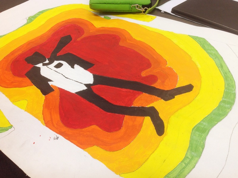
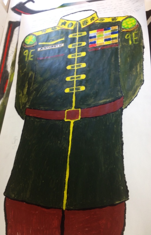
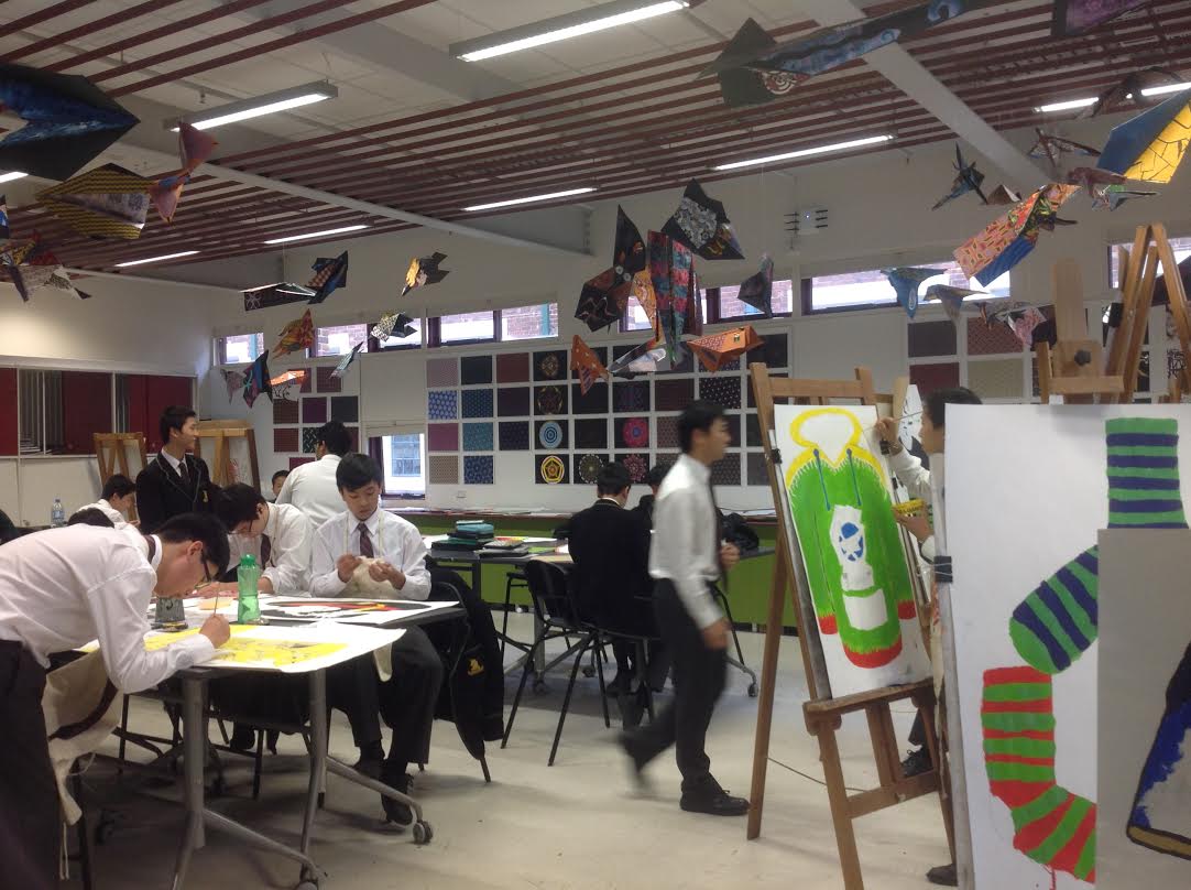
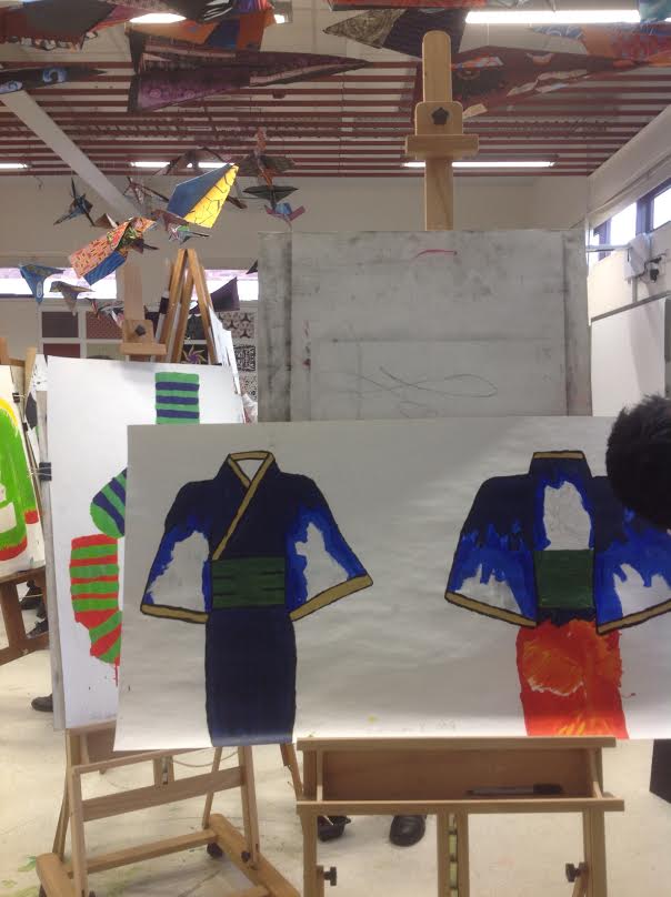
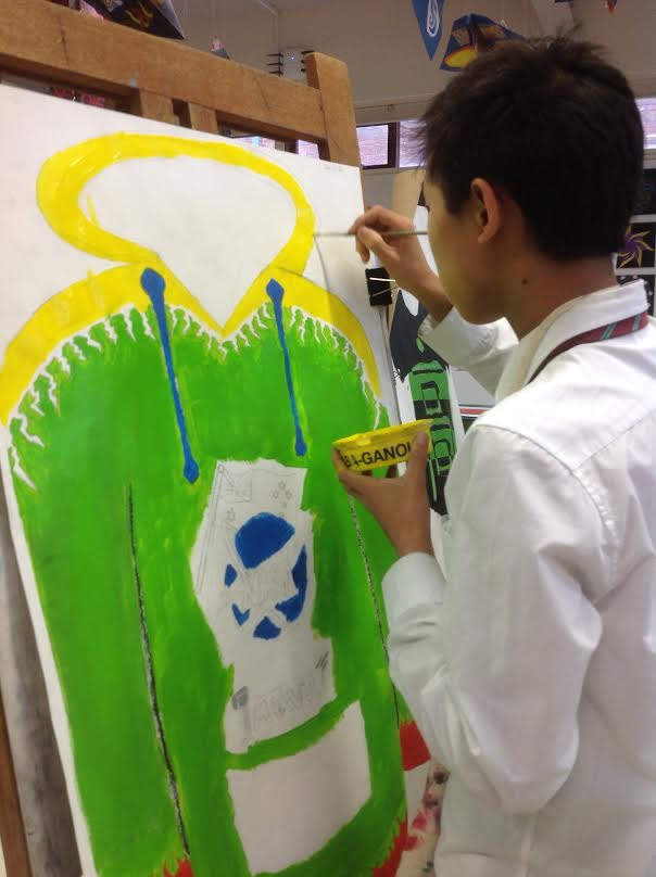
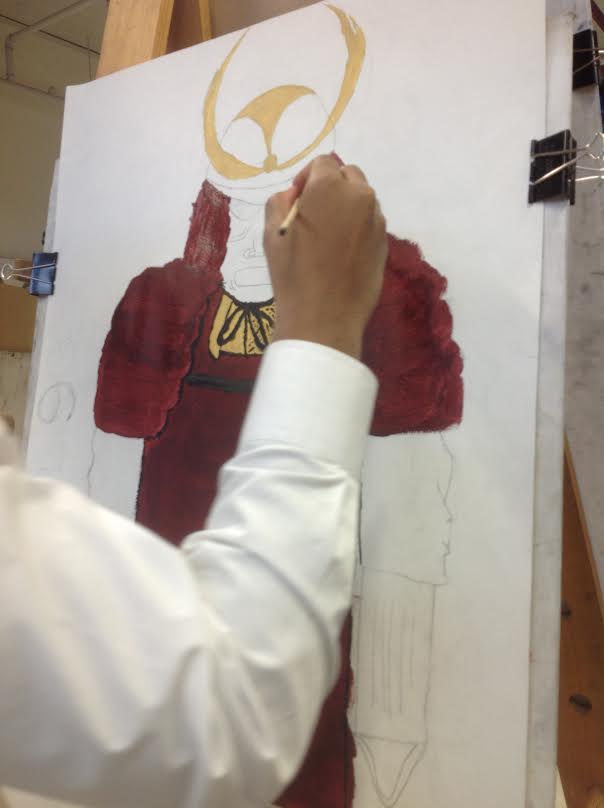
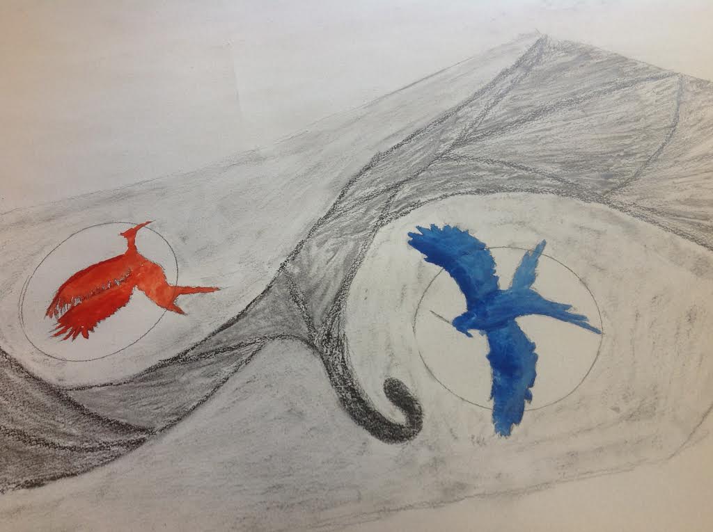
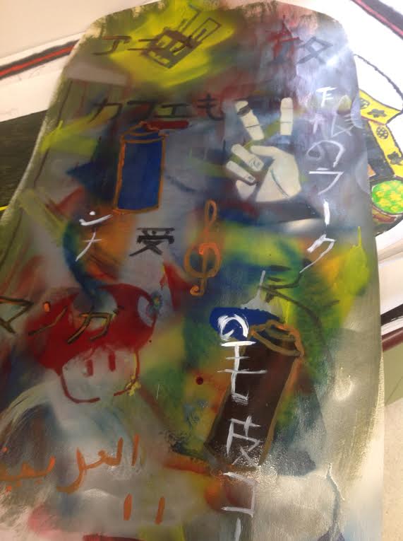
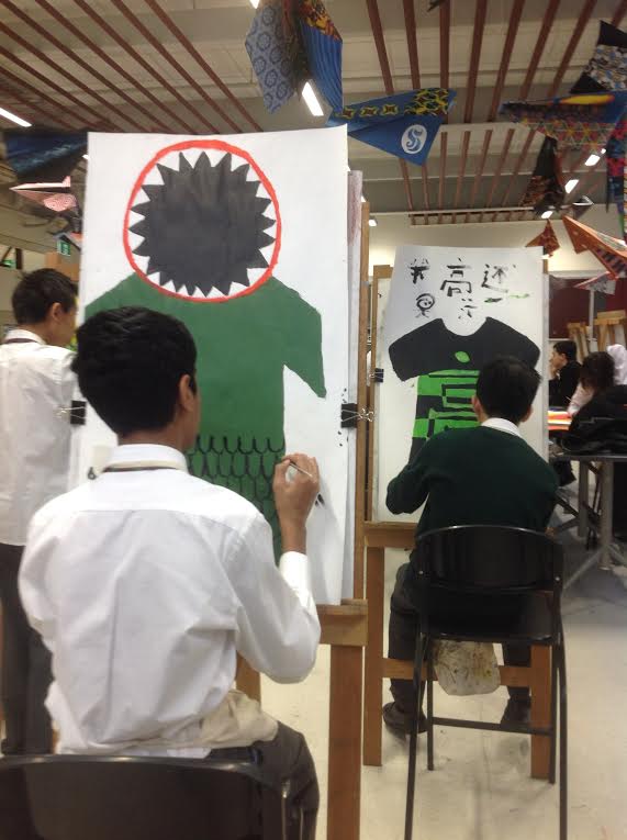
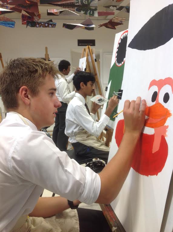
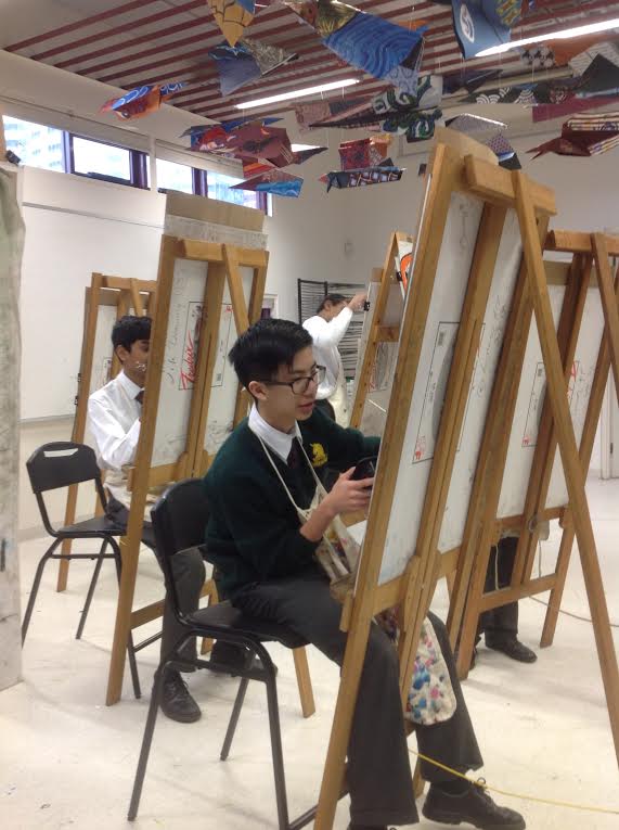
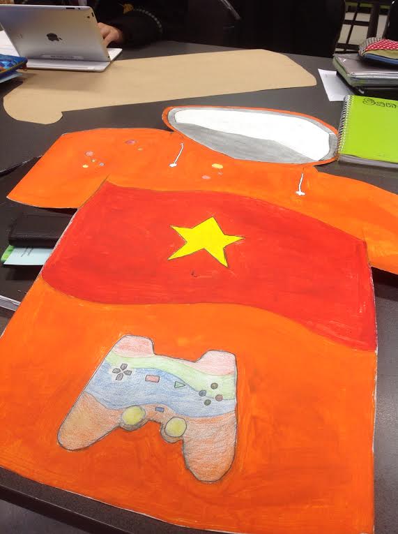
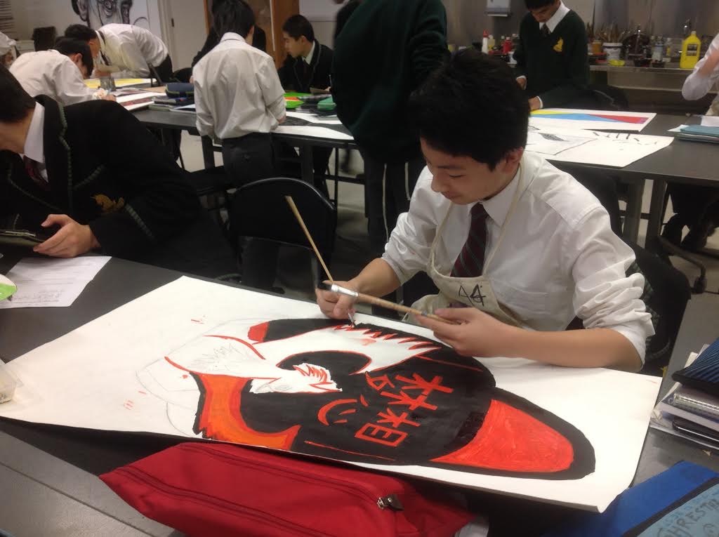
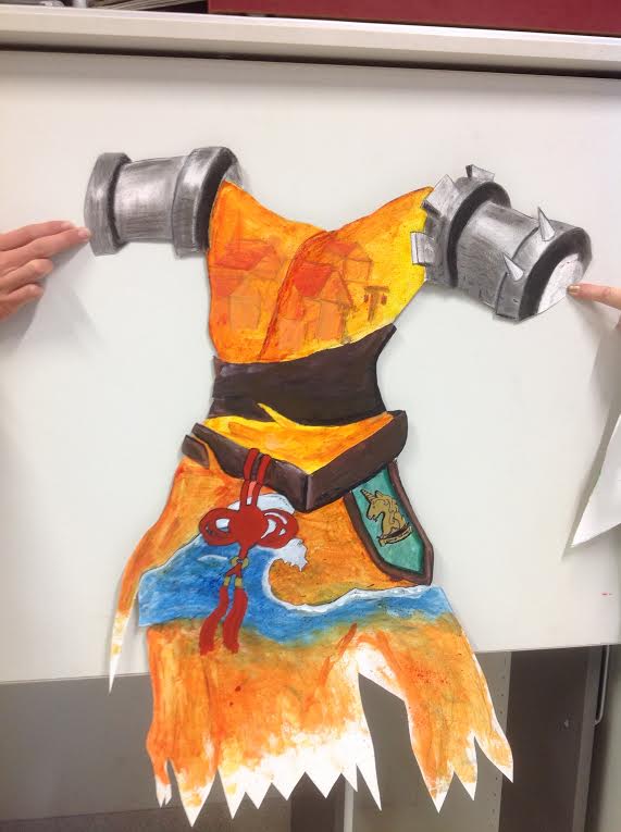
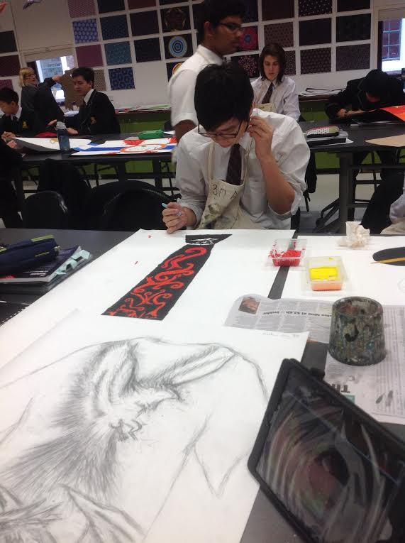
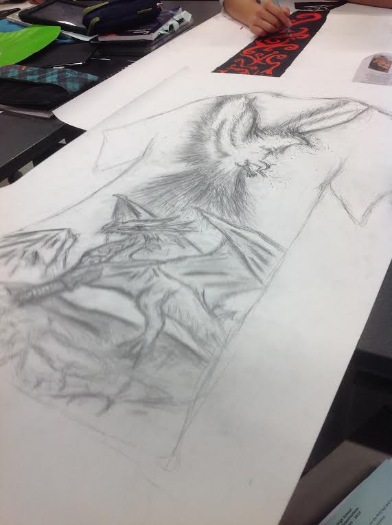
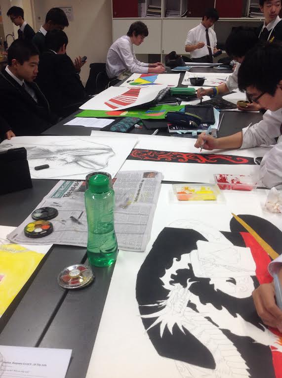
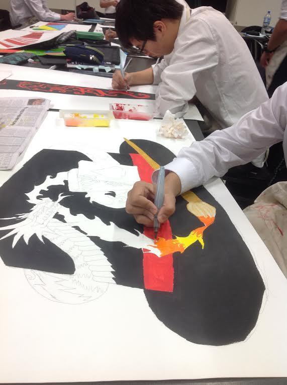
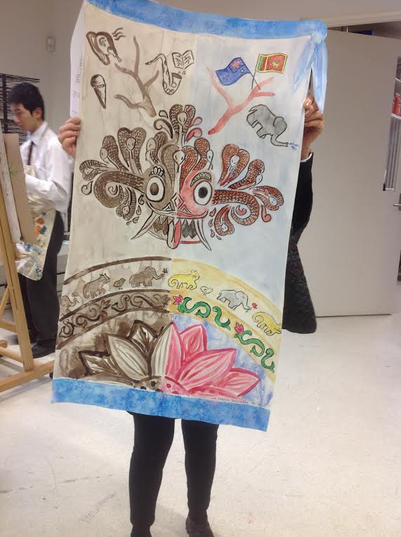
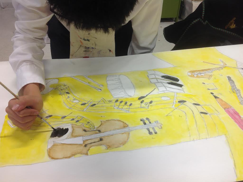
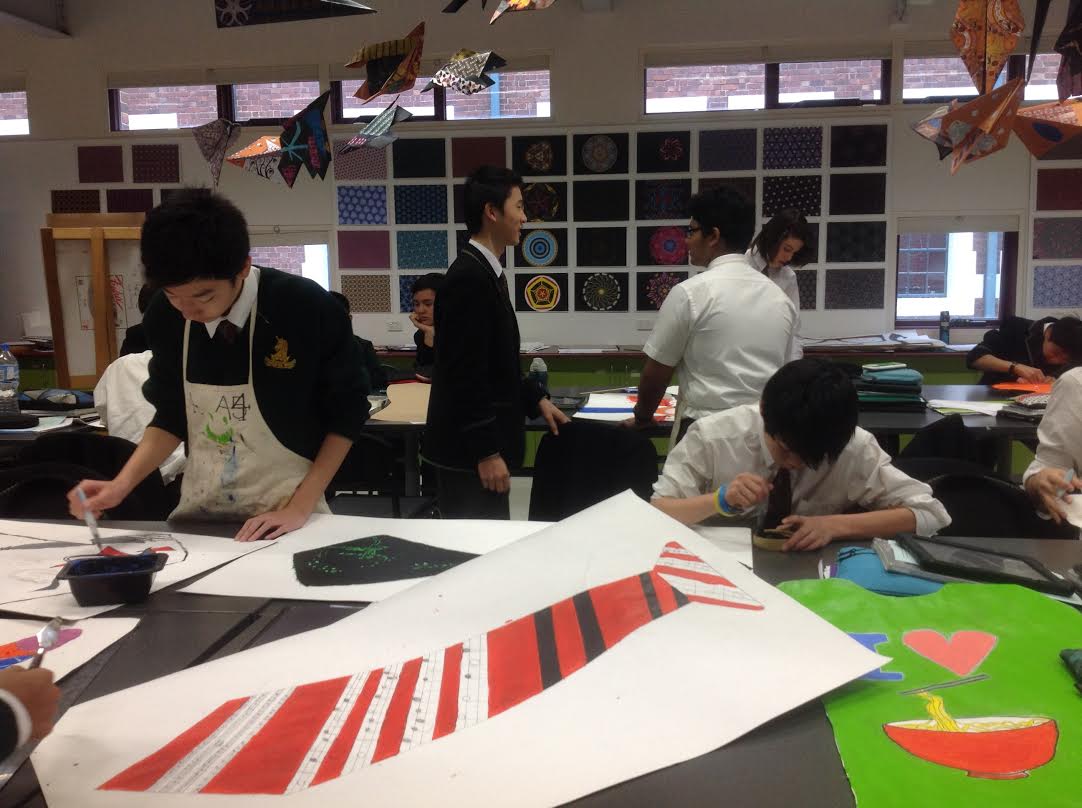
I visited a year 9 class today to see the students happily working on large representations of themselves based on their exploration of the unit ‘Home and Place’. My part in this project was the collaboration with Mihaela Brysha, Head of Art, in resourcing the project  in our library website (Libguides). I’m including the project brief:

This unit explores ideas about belonging and is designed to question our relationship and interaction with:

  • Others
  • Pop culture
  • Consumerism
  • Cultural beliefs,
  • Personal histories
  • The natural world

The aim of the exploration is to make and visually interpret personal statements about what home and place means to you and how it shapes personal and cultural identity.

Australian artists Patricia Piccinini, Fiona Hall, Gordon Bennett, and Howard Arkley address some of these ideas from very different perspectives, influences, art forms, aesthetics, materials and techniques. The study of their ideas and studio art practice as well as interpretation and analysis of their artwork aims to provide stimuli for the exploration of ideas, content and techniques for practical explorations.

The online resources were a starting point for further research into these artists:

Fiona HallGordon BennettHoward ArkleyPatricia Piccinini

The art of Gordon Bennett strikes a chord with many of our students whose families come from different countries. Bennett’s art depicts the cultural tension between his ties to his Indigenous roots and his association with Western culture.

I loved the size of these art works, their bold colours and strokes, delicate details, diverse imagery and visual storytelling. I loved the energy and focused activity in the classroom, the productive interaction between students and teacher. I took photos.

Image (1) Image (2) Image unnamed (1) unnamed (2) unnamed (3) unnamed (4) unnamed (5) unnamed (7) unnamed (9) unnamed (10) unnamed (11) unnamed (12) unnamed (13) unnamed (14) unnamed (15) unnamed (16) unnamed (17) unnamed (18)
unnamed (20) unnamed (21) unnamed


I’m looking forward to the hanging of these in the art show. Well done, boys, and well done, Mihaela.

Year 9 Art project on paper, iPad and Pinterest


Our year 9s have been working through a project in art which combines the best in hands-on activity, iPad technology and social media. Mihaela designed a project in which students worked through a process starting with research of patterns from different cultural backgrounds and culminating in the students designing their own patterns using the iPad app, iOrnament, and creating an oversized paper plane decorated with their pattern designs.

The research process encouraged students to dip into a rich and diverse cultural store of patterns before deciding on the designs of their own, and including some of the elements of water, fire, earth, air and wood. They were to select one or more of these elements to fuse with the theme of rejuvenation of the spirit and sense of self.

I relish my partnership with Mihaela, Head of Art at Melbourne High School. Every teacher librarian appreciates the teacher who is happy to collaborate, and in my case the partnership is built on respect, reciprocal interests, love of creativity and experimentation,  a desire for excellence, and determination to create a challenging process leading to a synthesis of understanding and original design. After we chatted, I was clear about what Mihaela wanted for the students and how I could support the project. I created libguides with visual examples and links to further resources to get the students started and hopefully inspired.

patterns2

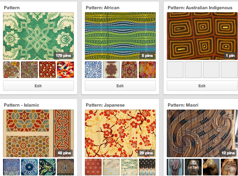
My research into examples of patterns within a broad range of cultural contexts was a joyful task for me. Pinterest is a rich online resource which allows the discovery and collection of an enormous number of high quality visual examples. I searched The Grammar of Ornament on Pinterest and was overjoyed with the results.  I referred the students to the Symbol Dictionary online for a bit of research on symbolic background. Delving into the how and why is always fascinating, and often informs the direction of research.

I didn’t want to overwhelm the students so I limited my pattern examples to some of the main cultural sources, but also linked to Pinterest boards I was creating along the way. If the students chose to, they could continue to browse collections of general patterns, and also African, Australian Indigenous, Chinese, Indian, Islamic, Japanese, Maori, Mexican, Moroccan, Russian and Turkish.  One of the advantages of using Pinterest is that you can continue to add visual examples to the collection without changing the link, so students will be able to view a continuously edited collection with one url. Students can also search within Pinterest itself. Design of online resources presents the challenge of depth without overwhelming the user, and a reasonable number of external links for further research.

[slideshare id=23985162&style=border:1px solid #CCC;border-width:1px 1px 0;margin-bottom:5px&sc=no]

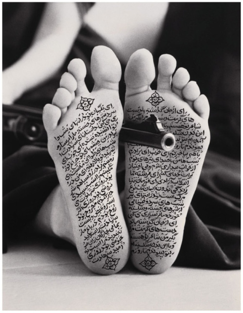
The students were also introduced to four artists for whom patterns were an intrinsic part of their art works. I created Pinterest boards for Shirin Neshat, Ah Xian, Ginger Riley Munduwalawala and Sangeeta Sandrasegar.


It’s a shame that the quality of the images in the following slideshow is not fantastic. I’ve included some general art study, such as colour theory, amongst the Pattern mix. Although you can’t read some of the text, you get an idea of the type of process journalling they have done.

[slideshare id=23999499&style=border:1px solid #CCC;border-width:1px 1px 0;margin-bottom:5px&sc=no]

The best part of this project, as far as I’m concerned, is the richness of the process. This is what I love about art – it is an example of the kind of process which should be embedded in all subjects. I was intent on documenting this patterns project in a blog post because it makes transparent what is most valuable about learning – the process of research (wondering, browsing, getting lost, refining search), working and re-working ideas and techniques, synthesizing found and created concepts and ideas, evaluating and reflecting and much more. Wouldn’t it be a smart world that required all students to study Art?

What’s been happening – term 3 has been a busy one

I’m not the only one remarking on the lapses between blog posts. The blog is no longer the main platform for sharing and communicating – there is a long, long list of online places which need to be fed and looked after – for me that includes other blogs, Twitter, Pinterest, Scoop.it, Diigo, Slideshare, Vimeo, Libguides, Facebook and all its groups, and more. So I thought I’d drop in and do a quick update on what may be worth checking out in case it’s helpful or even interesting.

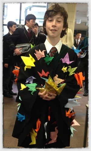
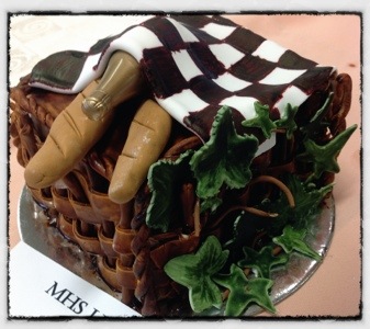
My school library blog has been keeping up with reading ambassadors for the National Year of Reading (#nyor12). These short and informal interviews are a pleasure to read, and reveal thoughtful responses to reading preferences. We’ve also recently celebrated 2012 Book Week with a hugely enjoyable ‘party’ in the library. I’ve included photos I think you’ll enjoy of our costume and cake competitions so that’s definitely worth checking out. This is the first Book Week celebration I’ve attended at Melbourne High School since I started a year ago, and it was fantastic. I was so impressed by the willingness of staff and students to dress up and play the part. The creativity displayed in our book-themed cake competition added a gastronomical dimension – who can resist cake? Yes, we did go on a bit about the cakes looking too good to eat but it didn’t last long.

I’ve been having such a good time resourcing the art curriculum in the last few months. My art blog churns out a diverse selection of inspiration to art students and teachers (I hope). This includes images, photography, design and animation.

Our students explored links to websites with antiquated encyclopedia images to create their ‘transformations’ which I combined in a slide show. The reduced image size doesn’t do justice to the details in the students’ work, so have a look at larger ones in Mihaela’s new art blog.

Yes! Our head of art now has a blog, and so do her students. This term our year 9s and 10s were lucky enough to get iPads, so we decided to get them to create Posterous blogs which we linked to Mihaela’s ‘mother blog’ and encouraged them to start snapping away with their iPad cameras so that they could develop a store of visual inspiration for their work. The beauty of a mobile device is the opportunity to capture photos as you go about your everyday activities. I’ve found the best images are the unexpected ones. I was inspired to get the art students blogging when I saw my dear friend, Marie Salinger’s, student blogs. Marie’s students have realised the rich potential of blogs in terms of journalling, reflecting, evaluating and just plain sharing. A blog is visual, it’s sequential, easy to access online and share with others; it invites responses and conversation. In her Visual Arts blog, Marie has reflected about the way in which iPads have enriched learning for her girls. The way Marie’s students used their blog to experiment with and evaluate iPad apps for drawing, then share with others, inspired me to talk to Mihaela about doing the same. Consequently I went into obsessive mode and lived and breathed art and apps for a couple of weeks, adding an Art Apps page in our LibGuides, my art blog, Pinterest, Flickr and Diigo.

Robot I am Apps used: Blender Pixeltwist                 (iphoneart.com)

Recently a dedicated team of students from the co-curricular group, Writing Competition, successfully wrote a book in a day. They had to collaboratively write at least 8,000 words and illustrate their story. The whole thing had to be done within 12 hours. I was very proud of the way they managed to work together and fuse their ideas and talents to produce a fantasy story for the Children’s Hospital. I hope to be able to share their book once I check the copyright.

Well, that’s it for now. Hope some of this has been useful to you.

Fingerpainting is back as iArt

I was very excited to find artists using iPad apps to draw, or ‘fingerpaint’, wonderful art. In some cases these projects are collaborative – that aspect always excites me. There are people who are sceptical about technology, in terms of the quality of things produced by apps – and I have to say I was one of those who thought of art apps more in terms of sketching ideas rather than creating a serious art work – or those who rate new technologies for doing the same things they already do only online. I’ve had many conversations with these people, and I feel that there is only one way to change their minds (bearing in mind that you can’t change a closed mind, but you can certainly try to surprise their minds open) is to find amazing examples of technology-enabled projects.

Yesterday I stumbled across (don’t ask me to trace that thread back to its source) fingerpainters – artists who use the iPad and even iPhone or iPod Touch to create art with drawing/painting apps. I have these apps on my iPad and I’ve shown them to art teachers, but without an inspirational example, those apps just sit there in their folders doing not much. Of course, when you find an artist through your Google Reader of from Twitter lists, you know the discovery will lead to many more discoveries, and so I want to share some of these artists and works, their blogs and where they also live on Twitter and Flickr.

I started by discovering the artist Benjamin Rabe and his Flickr sets, including this one of finger paintings he did on his iphone or ipad. A painting on his phone!

Of course, when you discover an artist who has an online presence, they lead you to many more artists. This is how I came across the amazing Cedric Phillipe’s Flickr photostream and his fingerpaintings on his iPad and his iPod Touch. How on earth somebody manages to create an artwork on such a small screen, I’ll never know.

Mojitos

This one is done on his iPod Touch mainly using the app Brushes

This one is done on his iPad mainly using the app Brushes

Cedric has a wonderful Tumblr blog which you must see. This is where I found his stop-motion animation. What a treat!

&nbsp[vimeo http://www.vimeo.com/44310015 w=500&h=375]

An impressive little set that Cedric built for his animation. Have a look at photos here.

The Helen Keller quote at the bottom of the Woven Narratives webpage nicely summarises what I consider the most exciting about emerging technologies – the collaborative aspect. “Alone we can do so little; together we can do so much.” – Helen Keller. Woven Narratives are the collective works of artists’ collaborations using mainly iPad apps to create their art works.

Most of the works presented here were created and shared using only the iPad as a drawing and painting tool. Recent pieces have developed in three dimensions as small ‘soft sculptures’and the latest round of work has seen the development of a series of paintings on cardboard, which have been shared by post. Each of the works has travelled an average of 40,000 miles during its creation, bouncing back and forth via email or through the international postal system as its individual narrative unfolds.

Particularly interesting is the value-added aspect of this technology-enabled project:

The collaborations have helped both of us develop and extend our image making practice and have pushed our personal work into new and interesting directions. The narratives which develop throughout the process of making the works are playful, intriguing and entertaining. Many of them are hidden by the process of making, whilst others peek through to reveal themselves in colourful and often humorous ways. The result is an ongoing dialogue of signs, symbols, image-making and colour, a series of ‘Woven Narratives’, which engage the viewer in a ‘mesh’ of images and marks which share collective stories and experiences.

I can relate to the idea of process, and particularly collaborative process, resulting in new and exciting learning. Surely the experimental nature of emerging technologies is leading to new ideas and possibilities. If we allow for time to play…

In any case, have a closer look at Woven Narratives and the artists responsible. One of the artists, Jonathan Grauel, has discovered new possibilities for art making with mobile devices since an accident with a table saw left him without an index finger on his dominate hand and limited sensitivity in his thumb. When his wife and friends surprised him with an iPhone, he discovered a new joy in “finger painting.”

A blessing for art students and teachers is when artists share their art work, ideas and techniques. The blog Fingerpainted shares apps used to create art works which you can see for yourself. The About page shares the evolution of the blog. Here’s a link to the posts tagged with ‘apps’ – very useful and full of examples.

UK artist, Fabric Lenny, and US artist, Jonathan Grauel, have teamed up to produce a body of work in iPad despite the distance between them. Sketchshare is a series of 154 images which were painted simultaneously in the iPads.

You can view all these pictures done in real time in their Flickr stream.

Finally, here’s a video game fingerpainted entirely on the iPad. The music was also composed on the iPad.

[youtube http://www.youtube.com/watch?v=Zjx8Fa-k_RE&w=560&h=315]

I hope this post will inspire some art students and teachers. I’ll add an iPad/iPhone apps page in my online art resources very soon.

We live in a visual world

I’m hooked on pictures, as some of you may know. And since I haven’t shared for a while, I thought I’d throw in a few examples of the visual delights I’ve been discovering. Some of these go into my art blog for student inspiration and others are just chucked into Diigo.

I fell in love with this animation a little while ago.

[vodpod id=Groupvideo.8757657&w=450&h=325&fv=]

The Tadpole
Follow my videos on vodpod

So much to love in this animation – the soft, translucent colours, the textures, the attention to detail and sense of wonder.

And how amazing is this paper art by Alexander Korzer-Robinson whose art focuses on the notion of the ‘inner landscape’.

The cut book art has been made by working through the books, page by page, cutting around some of the illustrations while removing others. The images seen in the finished work, are left standing in the place where they would appear in the complete book.

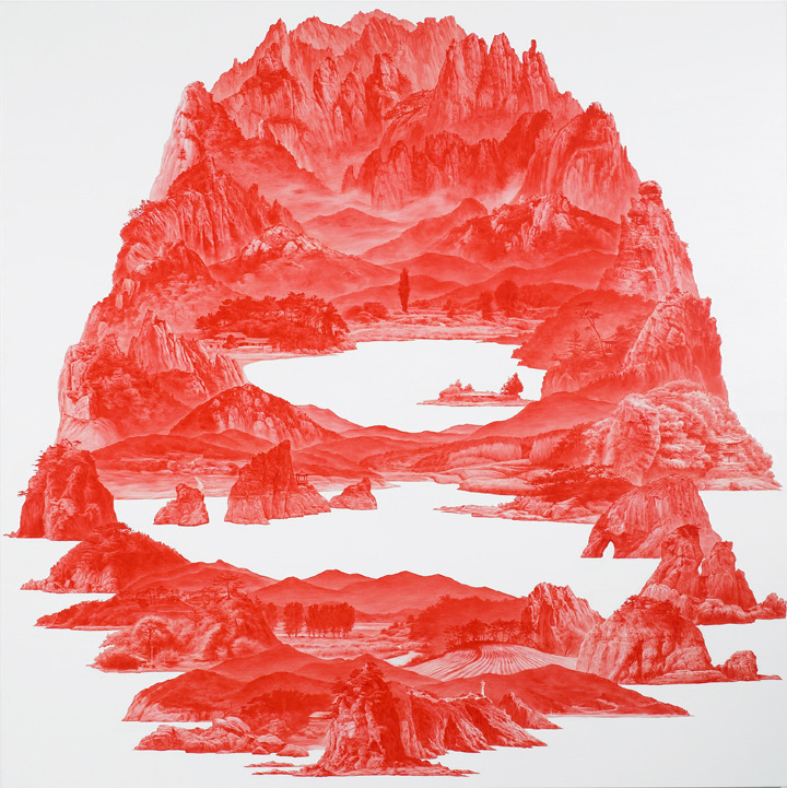
There’s something about Sea Hyun Lee’s red landscapes that I can’t define. That’s why you should read this analysis here.

Corinne Vionnet is the creator of a series of photographic works entitled “Photo Opportunities”, from hundreds of snapshots of tourist locations found on the Internet. By collecting and then bringing together successive layers of around a hundred similar “photo souvenirs”, these images conjure up questions about representation and memory of places.

I love the ethereal impression created by these dreamy versions of  cliched tourist landscapes.

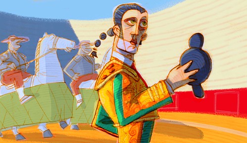
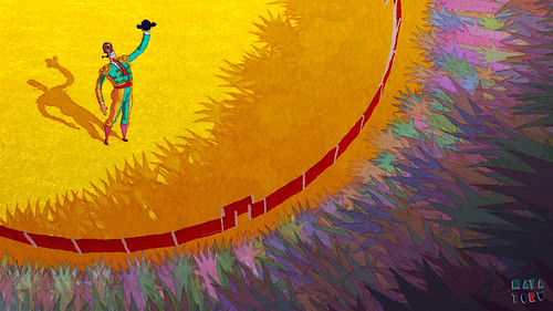
Matatoro is directed by Mauro CarraroRaphaël Calamote, and Jérémy Pasquet.  Motionographer has a fascinating post with an interview with the film makers on the process of the making of the film.

Watch the film on Vimeo. You will not regret it; it’s brilliant.

You can see the rest of the pictures in mapolito’s Flickr photostream.

I hope you’ve enjoyed this post. If you have any art/illustration/animation/film blogs you would recommend, please share.