Category Archives: art

Using the Medium blogging platform to teach critical and digital literacies in Art

My story

The teacher-librarian role is elastic

What I love the most about the teacher-librarian role is its elasticity; it can assume so many different shapes and play out in a variety of stories. In many cases teacher-librarians have come from classroom teaching and therefore bring their expertise and experience, as well as their passion for their methods. My teaching methods were English and LOTE (German and French) and this is what I taught before completing the Master of Education (Teacher Librarianship), however I also have a passion for the Arts, and love supporting and collaborating with teachers in the Arts faculty. 

New year, new challenges

Every year I challenge myself to a new project, aiming to forge new relationships with students and teachers while trying out something innovative – sometimes without knowing precisely what until it happens. When collaborating with teachers, I aim to integrate this collaboration over a longer period of time – at least a term, a year if possible. This gives me the opportunity to get to know the students and teacher, and experience their learning/teaching styles firsthand. 

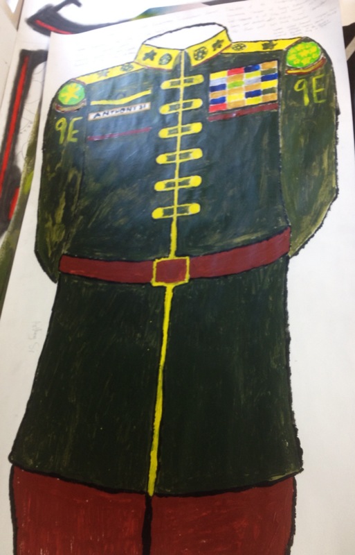
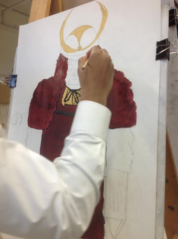
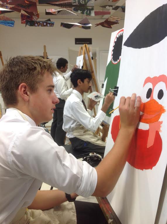
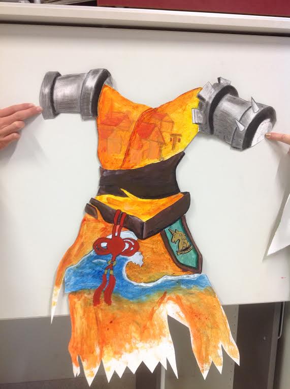
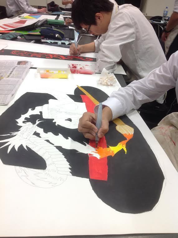
This year I approached an art teacher I’d worked with a couple of years ago, with an idea I had been contemplating for some time. Previous experiences in the art classroom had me thinking about two things: 

  1. How can we solve students’ blocks to creativity, and simultaneously broaden their exposure to a variety of art works and styles?
  2. How can we improve their critical literacies when discussing or writing about art?

The first point stems from my ongoing role in supporting art teachers and students by creating online resources (libguides);and the second point relates to a recent realisation that, if I’m supporting critical literacies, typically by working with English teachers, then why shouldn’t I do the same with those same literacies in art?

Using Medium as a blogging platform 

https://medium.com/art-viewpoints

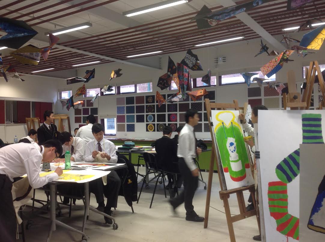
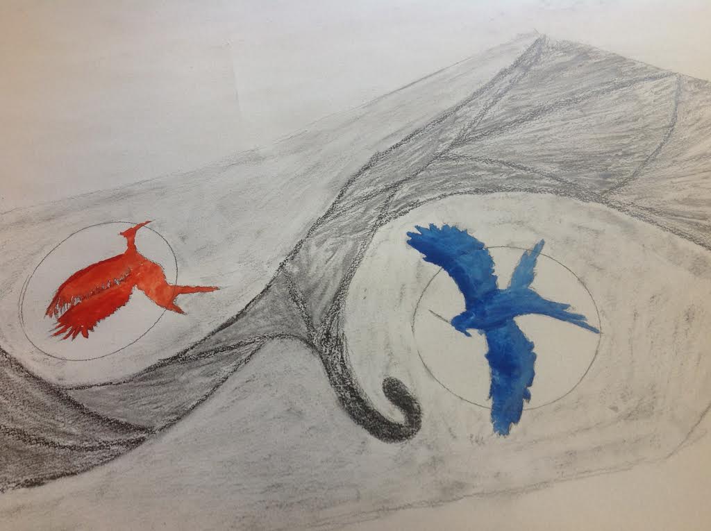
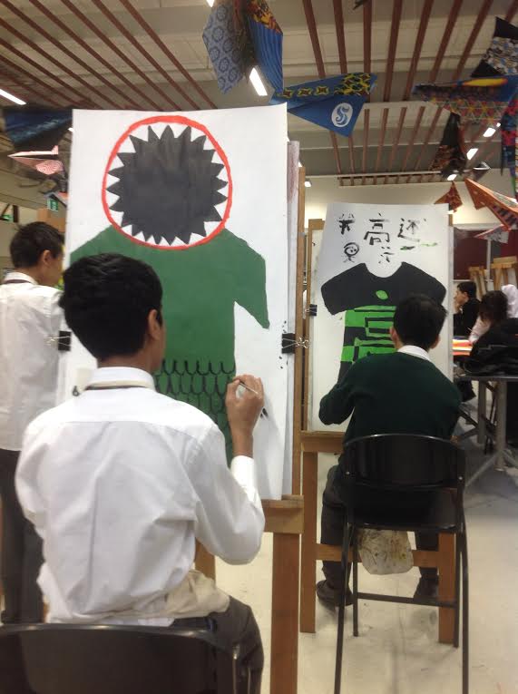
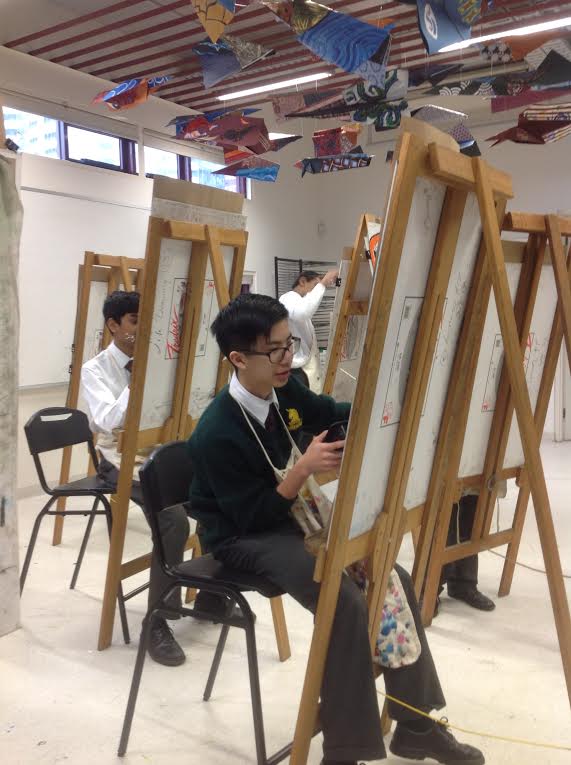
The teacher decided we would work with her year 10 Drawing and Painting class. I suggested to the art teacher that we use Medium as a blogging platform for our purposes. These were my reasons:

  1. The blog would be the space where we posted all our content and instructions;
  2. Student blogs would be easily accessible in the followers list;
  3. Students would be able to read each other’s posts, and respond to them (in the form of ‘clapping’ or comments),  resulting in the development of a reading/writing community;
  4. Images, videos and other media – particularly important in art teaching – could be easily embedded in the posts;
  5. Our blog and students’ blogs would be situated within a global writing/blogging community, instead of existing in isolation. The Medium homepage (https://medium.com/) is cleverly designed to entice the reader into further reading, based on reading history, as well as your network (as you follow people), and according to your self-appointed areas of interest. In this way students have agency over their feed, in the same way as they feel a sense of ownership while designing their blog.

From archive to targeted post

The Medium blogging platform enabled me to feature online resources I have been creating for years in our libguides. This is exciting because it solves the issue of how to make archived online resources relevant and pertinent to students and teachers. So, for example, when the teacher requested resources about an artist  or drawing techniques, I was able to pull these out of the libguides, and the blog post was all we needed for the lesson, easily mirrored on the large screen so students could follow the lesson, or set as homework prior to the lesson in the style of the ‘flipped classroom’. 

Medium allows the creation of tabs at the top of each page, and I realised, while thinking about blog design,  that I could create tabs for ‘drawing techniques’, ‘artists’, ‘artworks’, ‘critiques’ and ‘teacher posts’ and tag posts accordingly. The blog becomes an interactive resource, providing students with a wealth of resources they can easily navigate . 

The blog allows for quick and easy ‘just in time’ posting, so that my role in resourcing becomes ‘live’ when things come up during the lesson and I’m able to create a post on the spot. 

A real readership

When students post their writing in response to assigned tasks, they have a real audience, and this is very different to writing for their teacher. They usually feel more motivated to write, to edit their work before it gets published, and because we instruct them to read each others’ posts, they learn from each other. Students are also familiar with the ‘clapping’ (liking) and commenting options which are ubiquitous on all social media sites, and they enjoy being connected to the class, motivated also by the possibility of attracting a readership outside the school. Of course, it’s my job to monitor the appropriateness of all interactions.

Digital literacies

In the first lesson, I spoke to students about the implications of being published externally. The acceptable behaviour policies are permanently in the blog’s archive for students to revisit, or to use as gentle reminders. I also posted ‘How to comment on someone’s writing in an online environment’.

Commenting is actually harder than it first seems. Writing a ‘comment’ following another student’s post is much more than the monosyllabic or gif-laden comments on social media; it involves an understanding and evaluation of the post, and an articulate, constructive observation or even extension of the original ideas. These are additional literacies which, if not taught explicitly, or practised, will not be developed. 

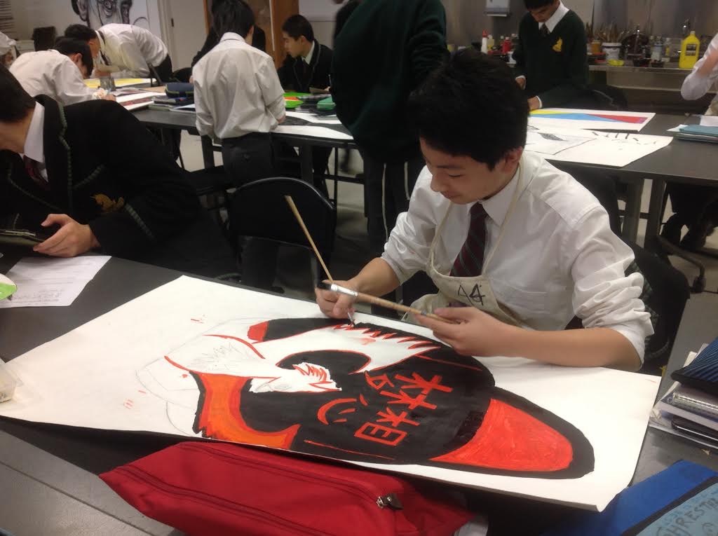
Critical literacies in art

We sometimes forget that critical literacies have been taught explicitly in art even before they gained prominence in our students’ skills set. In art, these critical skills develop as students learn to see, then unpack, discuss, and finally, write about an art work. Blogs lend themselves to short ‘lessons’ on what this might look like. For example, I posted: ‘How to critique someone else’s art work’ which begins with a light-hearted cartoon, and then shows a video created by ‘The Art Assignment: PBS digital studios’. There is so much relevant media freely available online on this topic, and it’s the teacher-librarian’s role to sift through and carefully curate the best resources for the class, as well as for the teacher. On the same topic, I also posted: ‘Ways of seeing and writing about art’, in which I included a video from Smart History, as well as one entitled: ‘How to understand a Picasso’. This kind of resourcing is time-consuming; teachers always appreciate teacher-librarians’ help in this area.

Progress so far

Despite being in its early stages, our digital resource is growing in leaps and bounds. I appreciate being informed by the teacher’s and students’ needs which arise during class time,  so that the blog evolves organically and often at point of need. I find this works so much more effectively compared to my earlier experiences of emailing the teacher to ask how I might support her. My participation in classes has resulted in so many more ideas, and our collaborative teaching and conversations during class inform my work. As we play off each other during the lesson, ideas are generated in the most productive and creative way.

What is it about the blog…?

Since working with blogs in classes from 2008, I’ve had a chance to reflect on what works well and how to innovate for even better results. I think that the separation into posts of what might become too dense and difficult for students to take in, is one of the advantages of teaching and learning this way. Tags, categories (tabs), hyperlinks – help students take in digestible amounts, and enable them to follow hyperlinks to further reading if they wish, or navigate the site to find what they need to revise content. These are the digital literacies teacher-librarians will often teach, and in this way we are not teaching them in isolation, but in context. 

Differentiation

When providing extension material for students, the blogging platform allows teacher-librarians to provide differentiation by posting content for depth and breadth, and tag posts accordingly. In art, there are always more examples and opportunities to expand students’ horizons with more artists, more techniques, art history, local exhibitions, art from featured museums and galleries, and articles or videos/podcasts about art issues. I’ve shared a range of broad and issues-based posts, eg. ‘Who decides what art means’; ‘Women artists and their struggle’‘It seems art can help you if you’re studying to become a doctor. Does that surprise you?’ 

Projects such as this one have me thinking about the tragedy of staffing in some school libraries. Even with well staffed libraries, teacher librarians might not have the opportunity to explore and experiment. Some of my most valuable experiences have developed from a mere hunch that something worthwhile might eventuate. Frankly, there is always a positive outcome when you experiment with the stretchiness of your role, even if it’s not what you expected. As I said earlier, the teacher-librarian role can play out in a variety of stories, all as diverse as we are. Let’s hope that we hold our ground in schools so that we can prove our value.

This article has been published in the SCIS ‘Connections’ magazine.

Visual Communication Design online resources – happy to share

(This has been reposted from Melbourne High School Library blog.)

Since I spend so many, many hours creating art and visual communication design resources online, it gives me great pleasure to share and know that people are using them.

I’ve recently added new resources in our Visual Arts and Visual Communication Design digital library – our Libguides.

On the Visual Communication Design page, look for the tabs at the top: Australian designers and design companies, Berlin designers/illustrators, European designers/illustrators, UK designers/illustrators, US designers/illustrators, and design agencies and organisations. All of these resources are new – I think you’ll love them because they are full of young, creative people and examples of the work, with links to how you can follow them on social media, eg Instagram, Facebook, Flickr, Tumblr, Twitter and other places. The beauty of the follow is that all the wonderful, new work comes to you in your feed and you’ll have daily inspiration to draw from. The diversity amongst the artists is amazing – in fact, you’ll be overwhelmed it (in a good way).

I’ll leave you with a few examples:

From the Berlin designers/illustrators page: Maria Bustamante (aka notflipper)

From the European designers/illustrators page: French artist Koralie. You can follow her onTumblrFacebook and on this website.

On the UK designers/illustrators pageJack Sachs is a London based 3D animator and illustrator.Read his blog and follow him on Twitter.

Nicolas Menard is a French Canadian graphic artist working and living in London. He makes drawings, prints, animations, books and interactive. Follow him on Vimeo,on tumblr, on Twitter, and on Instagram.

On the US designers/illustrators page, so far we have Ari Weinkle and you can follow Ari on Instagram, Facebook, Tumblr and Twitter.

Under Australian designers and design companiesKindred Studio is the multi-disciplinary studio of Sydney based Illustrator, Designer and Art Director Andrew Fairclough. Follow him on Instagram, on Twitter and Skillshare.

Benja Harney is a paper engineer. Follow him on Instagram. Benja is based in Sydney, Australia.

Also new in the Visual Arts libguides are most of the resources under the tab ‘For teachers’. There’s a lot of text here and so it doesn’t look very exciting but, believe me, if you take the time to explore the links you will not be disappointed. For example, in the box ‘general resources for teachers‘, I would recommend having a good look at Deon Van Dorp’s website. I met Deon in the High School Art Teachers Facebook group – a private group so if you want to join, just ask and wait to be approved. Deon is one of many art teachers sharing their expertise and student work examples here. Have a good dig around on Deon’s website, under all the tabs. For example, under the ‘More’ tab at the top, you will find Deon sharing the processes he goes through with students and examples of student work. Deon includes detailed descriptions of tools, techniques and shows the progress of student work from start to finish.

Also under the ‘More’ tab are examples of student visual diaries. There is lots of student work organised by year level throughout the website.

Flickr is another amazing resource for examples of art work including student work. I have a selection of these in the Visual Arts libguide (for teachers) under ‘student art work on Flickr’, for example, Monks Dyke Tennyson College, Lincolnshire. Don’t forget to select ‘albums’ when on Flickr to see different projects. There are many examples of student sketchbooks/folios, such as this one. I can’t share any images here because the permissions are restricted but you can still look.

On the same libguides page under the tab ‘for teachers’ there is a big selection of art teacher websites with examples of work. Developing Nicely by Chris Francis, UK Art teacher and Senior Leader at St Peter’s Catholic School, Bournemouth, England. The blog contains thought-provoking articles that are illustrated with creative, contemporary student artwork.

Ms King’s AP Studio Art Class This blog contains activities cover perspective, line drawing, the depiction of glass and metal objects, working in monochrome, figure drawing and still life arrangements.

InThinking Visual Arts is a website for International Baccalaureate Art teachers written by Heather McReynolds, who has over 20 years of teaching and examining experience. Heather was previously Head of Art at the International School of Florence and now offers training and workshops for IB Art teachers, writes textbooks and shares knowledge via the InThinking Visual Arts website. Although this site is subscription based, there is enough free content to keep you busy for hours. For example, you can read an interesting article on attitudes to beauty.

Fortismere Art Department has lots of useful things under the tab ‘student area’ including ‘practical support’ (for photography, painting, film and more)  and ‘web tools’, such asphoto- and video-sharing, and also under the ‘student area’ tab, under ‘research support’ there is ‘research and analysis‘, ‘creative thinking’ and resources for photography genres eg portraiture.

Also helpful on this page is the box with tips from a high achieving art student.

I’ve also made a start on resources for students under the tab of the same name.

Sometimes it’s overwhelming navigating your way through our online resources so I hope it was useful for me to highlight a few of our newly created areas. Enjoy!

Art is not just pretty pictures: The deep process of artistic creation

My topic today is Art as a subject in schools. I wonder if we sometimes underestimate or misunderstand the role of Art in a student’s learning. It’s so much more than making pretty pictures. Art personifies learning through a transparent process of deep exploration and problem solving – with an end product to show for it. Just as with literature, the end product can be unpacked to reveal the influences which were part of the creative process. Fortunately this is not a purely scientific process but one which invites the exploration and interpretation of the viewer. Art is a model for problem solving in other areas of learning. We should hold onto Art, and not be fooled into thinking that it is less valuable than subjects which are associated with occupational success. We need Art.

I visited a year 9 class today to see the students happily working on large representations of themselves based on their exploration of the unit ‘Home and Place’. My part in this project was the collaboration with Mihaela Brysha, Head of Art, in resourcing the project  in our library website (Libguides). I’m including the project brief:

This unit explores ideas about belonging and is designed to question our relationship and interaction with:

  • Others
  • Pop culture
  • Consumerism
  • Cultural beliefs,
  • Personal histories
  • The natural world

The aim of the exploration is to make and visually interpret personal statements about what home and place means to you and how it shapes personal and cultural identity.

Australian artists Patricia Piccinini, Fiona Hall, Gordon Bennett, and Howard Arkley address some of these ideas from very different perspectives, influences, art forms, aesthetics, materials and techniques. The study of their ideas and studio art practice as well as interpretation and analysis of their artwork aims to provide stimuli for the exploration of ideas, content and techniques for practical explorations.

The online resources were a starting point for further research into these artists:

Fiona HallGordon BennettHoward ArkleyPatricia Piccinini

The art of Gordon Bennett strikes a chord with many of our students whose families come from different countries. Bennett’s art depicts the cultural tension between his ties to his Indigenous roots and his association with Western culture.

I loved the size of these art works, their bold colours and strokes, delicate details, diverse imagery and visual storytelling. I loved the energy and focused activity in the classroom, the productive interaction between students and teacher. I took photos.

Image (1) Image (2) Image unnamed (1) unnamed (2) unnamed (3) unnamed (4) unnamed (5) unnamed (7) unnamed (9) unnamed (10) unnamed (11) unnamed (12) unnamed (13) unnamed (14) unnamed (15) unnamed (16) unnamed (17) unnamed (18)
unnamed (20) unnamed (21) unnamed


I’m looking forward to the hanging of these in the art show. Well done, boys, and well done, Mihaela.

Year 9 Art project on paper, iPad and Pinterest


Our year 9s have been working through a project in art which combines the best in hands-on activity, iPad technology and social media. Mihaela designed a project in which students worked through a process starting with research of patterns from different cultural backgrounds and culminating in the students designing their own patterns using the iPad app, iOrnament, and creating an oversized paper plane decorated with their pattern designs.

The research process encouraged students to dip into a rich and diverse cultural store of patterns before deciding on the designs of their own, and including some of the elements of water, fire, earth, air and wood. They were to select one or more of these elements to fuse with the theme of rejuvenation of the spirit and sense of self.

I relish my partnership with Mihaela, Head of Art at Melbourne High School. Every teacher librarian appreciates the teacher who is happy to collaborate, and in my case the partnership is built on respect, reciprocal interests, love of creativity and experimentation,  a desire for excellence, and determination to create a challenging process leading to a synthesis of understanding and original design. After we chatted, I was clear about what Mihaela wanted for the students and how I could support the project. I created libguides with visual examples and links to further resources to get the students started and hopefully inspired.

patterns2

My research into examples of patterns within a broad range of cultural contexts was a joyful task for me. Pinterest is a rich online resource which allows the discovery and collection of an enormous number of high quality visual examples. I searched The Grammar of Ornament on Pinterest and was overjoyed with the results.  I referred the students to the Symbol Dictionary online for a bit of research on symbolic background. Delving into the how and why is always fascinating, and often informs the direction of research.

I didn’t want to overwhelm the students so I limited my pattern examples to some of the main cultural sources, but also linked to Pinterest boards I was creating along the way. If the students chose to, they could continue to browse collections of general patterns, and also African, Australian Indigenous, Chinese, Indian, Islamic, Japanese, Maori, Mexican, Moroccan, Russian and Turkish.  One of the advantages of using Pinterest is that you can continue to add visual examples to the collection without changing the link, so students will be able to view a continuously edited collection with one url. Students can also search within Pinterest itself. Design of online resources presents the challenge of depth without overwhelming the user, and a reasonable number of external links for further research.

[slideshare id=23985162&style=border:1px solid #CCC;border-width:1px 1px 0;margin-bottom:5px&sc=no]

The students were also introduced to four artists for whom patterns were an intrinsic part of their art works. I created Pinterest boards for Shirin Neshat, Ah Xian, Ginger Riley Munduwalawala and Sangeeta Sandrasegar.


It’s a shame that the quality of the images in the following slideshow is not fantastic. I’ve included some general art study, such as colour theory, amongst the Pattern mix. Although you can’t read some of the text, you get an idea of the type of process journalling they have done.

[slideshare id=23999499&style=border:1px solid #CCC;border-width:1px 1px 0;margin-bottom:5px&sc=no]

The best part of this project, as far as I’m concerned, is the richness of the process. This is what I love about art – it is an example of the kind of process which should be embedded in all subjects. I was intent on documenting this patterns project in a blog post because it makes transparent what is most valuable about learning – the process of research (wondering, browsing, getting lost, refining search), working and re-working ideas and techniques, synthesizing found and created concepts and ideas, evaluating and reflecting and much more. Wouldn’t it be a smart world that required all students to study Art?

Fingerpainting is back as iArt

I was very excited to find artists using iPad apps to draw, or ‘fingerpaint’, wonderful art. In some cases these projects are collaborative – that aspect always excites me. There are people who are sceptical about technology, in terms of the quality of things produced by apps – and I have to say I was one of those who thought of art apps more in terms of sketching ideas rather than creating a serious art work – or those who rate new technologies for doing the same things they already do only online. I’ve had many conversations with these people, and I feel that there is only one way to change their minds (bearing in mind that you can’t change a closed mind, but you can certainly try to surprise their minds open) is to find amazing examples of technology-enabled projects.

Yesterday I stumbled across (don’t ask me to trace that thread back to its source) fingerpainters – artists who use the iPad and even iPhone or iPod Touch to create art with drawing/painting apps. I have these apps on my iPad and I’ve shown them to art teachers, but without an inspirational example, those apps just sit there in their folders doing not much. Of course, when you find an artist through your Google Reader of from Twitter lists, you know the discovery will lead to many more discoveries, and so I want to share some of these artists and works, their blogs and where they also live on Twitter and Flickr.

I started by discovering the artist Benjamin Rabe and his Flickr sets, including this one of finger paintings he did on his iphone or ipad. A painting on his phone!

Of course, when you discover an artist who has an online presence, they lead you to many more artists. This is how I came across the amazing Cedric Phillipe’s Flickr photostream and his fingerpaintings on his iPad and his iPod Touch. How on earth somebody manages to create an artwork on such a small screen, I’ll never know.

Mojitos

This one is done on his iPod Touch mainly using the app Brushes

This one is done on his iPad mainly using the app Brushes

Cedric has a wonderful Tumblr blog which you must see. This is where I found his stop-motion animation. What a treat!

&nbsp[vimeo http://www.vimeo.com/44310015 w=500&h=375]

An impressive little set that Cedric built for his animation. Have a look at photos here.

The Helen Keller quote at the bottom of the Woven Narratives webpage nicely summarises what I consider the most exciting about emerging technologies – the collaborative aspect. “Alone we can do so little; together we can do so much.” – Helen Keller. Woven Narratives are the collective works of artists’ collaborations using mainly iPad apps to create their art works.

Most of the works presented here were created and shared using only the iPad as a drawing and painting tool. Recent pieces have developed in three dimensions as small ‘soft sculptures’and the latest round of work has seen the development of a series of paintings on cardboard, which have been shared by post. Each of the works has travelled an average of 40,000 miles during its creation, bouncing back and forth via email or through the international postal system as its individual narrative unfolds.

Particularly interesting is the value-added aspect of this technology-enabled project:

The collaborations have helped both of us develop and extend our image making practice and have pushed our personal work into new and interesting directions. The narratives which develop throughout the process of making the works are playful, intriguing and entertaining. Many of them are hidden by the process of making, whilst others peek through to reveal themselves in colourful and often humorous ways. The result is an ongoing dialogue of signs, symbols, image-making and colour, a series of ‘Woven Narratives’, which engage the viewer in a ‘mesh’ of images and marks which share collective stories and experiences.

I can relate to the idea of process, and particularly collaborative process, resulting in new and exciting learning. Surely the experimental nature of emerging technologies is leading to new ideas and possibilities. If we allow for time to play…

In any case, have a closer look at Woven Narratives and the artists responsible. One of the artists, Jonathan Grauel, has discovered new possibilities for art making with mobile devices since an accident with a table saw left him without an index finger on his dominate hand and limited sensitivity in his thumb. When his wife and friends surprised him with an iPhone, he discovered a new joy in “finger painting.”

A blessing for art students and teachers is when artists share their art work, ideas and techniques. The blog Fingerpainted shares apps used to create art works which you can see for yourself. The About page shares the evolution of the blog. Here’s a link to the posts tagged with ‘apps’ – very useful and full of examples.

UK artist, Fabric Lenny, and US artist, Jonathan Grauel, have teamed up to produce a body of work in iPad despite the distance between them. Sketchshare is a series of 154 images which were painted simultaneously in the iPads.

You can view all these pictures done in real time in their Flickr stream.

Finally, here’s a video game fingerpainted entirely on the iPad. The music was also composed on the iPad.

[youtube http://www.youtube.com/watch?v=Zjx8Fa-k_RE&w=560&h=315]

I hope this post will inspire some art students and teachers. I’ll add an iPad/iPhone apps page in my online art resources very soon.

We live in a visual world

I’m hooked on pictures, as some of you may know. And since I haven’t shared for a while, I thought I’d throw in a few examples of the visual delights I’ve been discovering. Some of these go into my art blog for student inspiration and others are just chucked into Diigo.

I fell in love with this animation a little while ago.

[vodpod id=Groupvideo.8757657&w=450&h=325&fv=]

The Tadpole
Follow my videos on vodpod

So much to love in this animation – the soft, translucent colours, the textures, the attention to detail and sense of wonder.

And how amazing is this paper art by Alexander Korzer-Robinson whose art focuses on the notion of the ‘inner landscape’.

The cut book art has been made by working through the books, page by page, cutting around some of the illustrations while removing others. The images seen in the finished work, are left standing in the place where they would appear in the complete book.

There’s something about Sea Hyun Lee’s red landscapes that I can’t define. That’s why you should read this analysis here.

Corinne Vionnet is the creator of a series of photographic works entitled “Photo Opportunities”, from hundreds of snapshots of tourist locations found on the Internet. By collecting and then bringing together successive layers of around a hundred similar “photo souvenirs”, these images conjure up questions about representation and memory of places.

I love the ethereal impression created by these dreamy versions of  cliched tourist landscapes.

Matatoro is directed by Mauro CarraroRaphaël Calamote, and Jérémy Pasquet.  Motionographer has a fascinating post with an interview with the film makers on the process of the making of the film.

Watch the film on Vimeo. You will not regret it; it’s brilliant.

You can see the rest of the pictures in mapolito’s Flickr photostream.

I hope you’ve enjoyed this post. If you have any art/illustration/animation/film blogs you would recommend, please share.

New: Google Art Project

Google has developed a new project – The Google Art Project.

Explore museums from around the world, discover and view hundreds of artworks at incredible zoom levels, and even create and share your own collection of masterpieces.

Here’s a video showing you how to use the site:

[youtube=http://www.youtube.com/watch?v=GThNZH5Q1yY]

You can create your own art collection, add notes to  join a discussion about art, save closeups, share collections with people across networks, take a trip to different museums, and more.

Take a look at some of the art museums involved in this project

[youtube=http://www.youtube.com/watch?v=aYXdEUB0VgQ]

Google approached the museum partners without any curatorial direction, and each museum was able to chose the number of galleries, artwork and information they wanted to include, based on reasons specific to them. All content in the information panel pertaining to individual artworks was also provided by the museums.

At this stage, these are the museums involved:

  • Alte Nationalgalerie, Berlin – Germany
  • Freer Gallery of Art, Smithsonian, Washington DC – USA
  • The Frick Collection, NYC – USA
  • Gemäldegalerie, Berlin – Germany
  • The Metropolitan Museum of Art, NYC – USA
  • MoMA, The Museum of Modern Art, NYC – USA
  • Museo Reina Sofia, Madrid – Spain
  • Museo Thyssen – Bornemisza, Madrid – Spain
  • Museum Kampa, Prague – Czech Republic
  • National Gallery, London – UK
  • Palace of Versailles – France
  • Rijksmuseum, Amsterdam – The Netherlands
  • The State Hermitage Museum, St Petersburg – Russia
  • State Tretyakov Gallery, Moscow – Russia
  • Tate Britain, London – UK
  • Uffizi Gallery, Florence – Italy
  • Van Gogh Museum, Amsterdam – The Netherlands

I’m sure this list will grow. What an exciting project. I’m looking forward to browsing the art and also to what will develop here in the future.


Art still matters

Your golden hair, Margarete by Anselm Kiefer. Title derived from Death Fugue by Romanian Jewish poet and WWII survivor Paul Celan. Read more here.

The school year is starting again and so I thought I should air out some of my blogs and other resources because they’ve been put away in the top cupboard during the long break.

Remember the art blog? Art does matter.  Remember how, towards the end of last year, I revised the look of the blog so that it came out all svelte and user-friendly?

Well, don’t think it’s been sitting there idly, it’s been hatching lots of new art to stun you. Students, teachers and art lovers, get ready to be inspired by the diverse talent which is about to unfold before your eyes. I snuck in three examples during January (couldn’t help myself), one of which you see above, and then two animations.

[vimeo http://vimeo.com/16262803]

This one would be great for a discussion about issues such as beauty, bullying, female exclusivity, perhaps.

Some of you will know that I’m a fan of Russian animation, so here’s a claymation example by Serge Merinov.

[youtube=http://www.youtube.com/watch?v=OqbyUuFmhig]

So bookmark this blog if you have any interest in art. I’ll do all the work and present you with visual delights throughout the year. What do you say?

PS  The wiki is a good accompaniment but you have to take time to browse.

Art is…

My sister has worked for 3 years on a body of work – almost every Saturday afternoon and one day a week – which is currently being exhibited at fortyfivedownstairs.

I admire my sister’s talent, dedication and intelligence as an artist. She has what I have described in my previous post a positive obsession, an obsession which tunnels through to a truth which is unique to her vision. I happen to think that what is created from this kind of obsession is worth contemplating.

I am not in any way educated in art, and so my response and interpretation of any work of art remains personal, even ridiculous perhaps. Still, I’d like to attempt to express in words my uneducated understanding of her pieces.

Here is the gallery’s biography and description for Lena Torikov:

The works in Subtractions explore the possibility of tension and space within a three dimensional surface; although Torikov is trained as a painter, her current work replaces traditional subject matter and colour with an abstract composition of white shapes. Foamcore has replaced linen and brushes have been exchanged for a sharp knife.

Subtractions are works experimenting with surfaces to build city-like constructions and slices of landscapes based on memory and the impact the immediate environment has on us.

One thing I know about Lena’s work is that it evolves from a tireless, disciplined and critical process. Her focus is far from superficial and never flighty. This is the obsessive aspect; she will not grab at any idea until she has worked through relentlessly to what she sees as completion and only then will she move on. I admire this ability to maintain focus because I shift with the wind and run after anything that moves.

It’s interesting but not unusual that Lena has evolved from paint, colour, representative art to some degree, to 3-dimensional work, in this case all white, concentrating on form and space. I’m not sure what she would say about my understanding of her work because she has been relunctant to talk about what her art means or what it’s trying to do, at least to me. The only thing I remember her saying is that she likes to focus on the space between the forms. I’m not sure if I’ve understood this correctly but, to me, she seems to be paring down representational image (isn’t any image a representation of some sort?) to a purer form. Without the distraction of colour variation, dependence on the replication of identified forms, her art is playing with the mathematics of form, spaces and the relationship between these.

What happens when you add this shape, this line? And what if it’s smaller, larger? Why don’t we extend these forms out into space and take the equation even further? Further still when we observe the changing light transform the work; the shadows cast on the wall around the work, shorter or longer, first this way, then that. Follow the movement created within the frame of the piece, enjoy the contrast between empty space and overcrowdedness.

Conceptual work is how I interpret this art. A thinking person drilling down to deeper truths. Not always entirely serious, Lena throws light-hearted allusions into the mix – maybe because the tension is too much even for her, but probably for an entirely different reason.

In the case of one of her works in this exhibition, there is an obvious reference to the Sydney Harbour – yes, the works are quite ‘architectural’ – but then our perception of this is shaken up again. The whole thing is turned around so that, if we insist on viewing the recognisable landmark, we have to turn our head sideways and bend down at a 90 degree angle. We are forced to adapt to a changed view, or be very uncomfortable if we insist on seeing it in a familiar way.

For me – and I love good representational art – Lena’s mental activity within the abstract genre produces an image which I don’t easily tire of. So much art is instantly attractive but quickly become boring. These pieces are like puzzles – not to be solved but offering new ideas. Not disturbing in a way you would expect disturbing to be, but unsettling in a challenging way.

And I hope she won’t find it offensive if I say that she still produces beautiful lines, pleasing shapes, perfect relationships in between. I’m not sure if it’s beauty she is aiming to produce, but the works are very beautiful.

There is variety in the selection of pieces exhibited – in size and complexity – and the viewer is treated to just the right amount of it.  As a whole, the selection fits together into a larger puzzle.

Unlike James Yuncken’s lovely paintings of his trip to Cape York, a pictorial journey capturing the feel of the landscape and tones of the land and sky, Lena’s art is a carefully orchestrated collection of symbols. James’ selection could easily be extended with more pictures, like photos, of his trip. Lena’s collection can hold no more; she has said all she has to say.

I wonder what kind of person would appreciate this conceptual art. It’s definitely not the kind of art which warms the heart because it reminds you of a place you’ve been; it’s more like the kind of art that takes you where you might not have been, or haven’t stayed so as to pause and reflect.

Photos by Alexander Sheko.

New tools for traditional skills

[youtube=http://www.youtube.com/watch?v=5OLP4nbAVA4]

I found this video in a blog post on Art in the real world.

An Apple ipad live fingerpainting demo that David Kassan streamed live from my Brooklyn studio on Monday June 21st. 2010, The model sat for 3 hours as David painted and answered questions on how I use the iPad and the Brushes app.

This is an amazing example of how the latest technology can still be used in a traditional way, so to speak. I love the sped-up version at the end which makes transparent the pattern of layering in the creation of the portrait.